1_[css]transition and transform
CSS-전환 변환 Transition
A.❓ Transition ❓
- CSS 속성의 전환 효과를 지정
- 단축, 개별 속성 지원
🌟 s(sec) 단위 뿐 아니라 ms(milli seconds) 단위도 지원 가능
🌟 transition은 바뀌기 전 상태에서 기재해둔다!
🌟 타이밍 함수는 느렸다가 빨라질 건지, 빨랐다가 느려질 건지, 일정하게 진행할 것인지를 정하는 방법!
- transition-delay는 자주 사용되지는 않음
<!DOCTYPE html>
<html lang="ko">
<head>
<meta charset="UTF-8">
<meta http-equiv="X-UA-Compatible" content="IE=edge">
<meta name="viewport" content="width=device-width, initial-scale=1.0">
<title>Document</title>
<style>
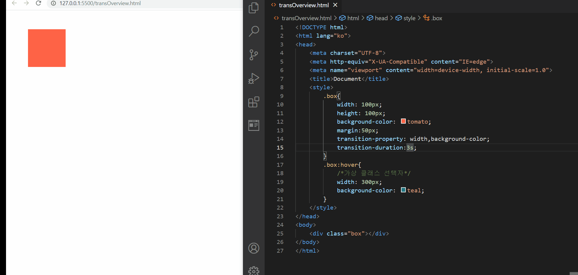
.box{
width: 100px;
height: 100px;
background-color: tomato;
margin:50px;
transition-property: width,background-color;
transition-duration:3s;
}
.box:hover{
/*가상 클래스 선택자*/
width: 300px;
background-color: teal;
}
</style>
</head>
<body>
<div class="box"></div>
</body>
</html>
CSS- 전환효과를 지원하는 transition 속성
위와 같이 transition 속성을 이용하면 transition-property에 어떤 속성에 전환효과를 줄 것이고 그것의 지속 시간이 어떻게 될 것인지를 명시해준다면 위와 같이 어떤 동작이 일어났을 때 전환효과가 일어나는 것을 확인해볼 수 있다
그리고 위에서 개별속성으로 transition-~~~로 적어준 부분은
transition : width 3s, background-color 3s;
와 같이 한 줄의 단축 속성으로 적어줄 수도 있다!
<!DOCTYPE html>
<html lang="ko">
<head>
    <meta charset="UTF-8">
    <meta http-equiv="X-UA-Compatible" content="IE=edge">
    <meta name="viewport" content="width=device-width, initial-scale=1.0">
    <title>Document</title>
    <style>
        .box{
            width: 100px;
            height: 100px;
            background-color: tomato;
            margin:50px;
            transition: width 3s,background-color 3s;
        }
        .box:hover{
            /*가상 클래스 선택자*/
            width: 300px;
            background-color: teal;
        }
    </style>
</head>
<body>
    <div class="box"></div>
</body>
</html>
그리고 앞서, transition-property의 기본값은 all이라는 점을 상기해보자
<!DOCTYPE html>
<html lang="ko">
<head>
    <meta charset="UTF-8">
    <meta http-equiv="X-UA-Compatible" content="IE=edge">
    <meta name="viewport" content="width=device-width, initial-scale=1.0">
    <title>Document</title>
    <style>
        .box{
            width: 100px;
            height: 100px;
            background-color: tomato;
            margin:50px;
            transition: 3s;
        }
        .box:hover{
            /*가상 클래스 선택자*/
            width: 300px;
            background-color: teal;
        }
    </style>
</head>
<body>
    <div class="box"></div>
</body>
</html>

transition-property : all
위와 같이 transition-property의 기본값이 all 이기 때문에 해당 속성값이 존재하거나 존재하지 않아도 동작은 동일함을 확인해볼 수 있다
<!DOCTYPE html>
<html lang="ko">
<head>
    <meta charset="UTF-8">
    <meta http-equiv="X-UA-Compatible" content="IE=edge">
    <meta name="viewport" content="width=device-width, initial-scale=1.0">
    <title>Document</title>
    <style>
        .box{
            width: 100px;
            height: 100px;
            background-color: tomato;
            margin:50px;
            transition: width 1s;
        }
        .box:hover{
            /*가상 클래스 선택자*/
            width: 300px;
            background-color: teal;
        }
    </style>
</head>
<body>
    <div class="box"></div>
</body>
</html>

transition-특정 속성만 적용
또한 위의 경우에서처럼 특정 속성에 대해서만 transition을 적용할 수도 있다!
transition-timing-function 속성값
<!DOCTYPE html>
<html lang="ko">
<head>
    <meta charset="UTF-8">
    <meta http-equiv="X-UA-Compatible" content="IE=edge">
    <meta name="viewport" content="width=device-width, initial-scale=1.0">
    <title>Document</title>
    <style>
        .box{
            width: 100px;
            height: 100px;
            background-color: tomato;
            margin:50px;
            transition: all 3s ease-out;
        }
        .box:hover{
            /*가상 클래스 선택자*/
            width: 300px;
            background-color: teal;
        }
    </style>
</head>
<body>
    <div class="box"></div>
</body>
</html>
transition-timing-function
위의 예제에서 확인해볼 수 있듯이, timing-function이 linear일 경우에는 일정 시간 간격만큼 동작하고, ease-in에서는 어느 순간을 기점으로 갑자기 빨라지고, ease-out에서는 처음에는 빨랐다가 갑자기 느려지는 것을 확인해볼 수 있다. 그리고 ease-in-out은 위에서 설명했던 것처럼 갑자기 빨라졌다가 갑자기 느려지는 것처럼 보인다
그리고 steps(n)은 전환하는 과정이 다소 재미있는데, a초 동안의 전환과정을 n 단계로 쪼개어 보여준다
바로 아래처럼!
<!DOCTYPE html>
<html lang="ko">
<head>
    <meta charset="UTF-8">
    <meta http-equiv="X-UA-Compatible" content="IE=edge">
    <meta name="viewport" content="width=device-width, initial-scale=1.0">
    <title>Document</title>
    <style>
        .box{
            width: 100px;
            height: 100px;
            background-color: tomato;
            margin:50px;
            transition: all 3s steps(9);
        }
        .box:hover{
            /*가상 클래스 선택자*/
            width: 300px;
            background-color: teal;
        }
    </style>
</head>
<body>
    <div class="box"></div>
</body>
</html>
.gif?raw=true)
transition-timinig-function:steps(n)
<!DOCTYPE html>
<html lang="ko">
<head>
    <meta charset="UTF-8">
    <meta http-equiv="X-UA-Compatible" content="IE=edge">
    <meta name="viewport" content="width=device-width, initial-scale=1.0">
    <title>Document</title>
    <style>
        .box{
            width: 100px;
            height: 100px;
            background-color: tomato;
            margin:50px;
            transition: all 3s linear 5s;
        }
        .box:hover{
            /*가상 클래스 선택자*/
            width: 300px;
            background-color: teal;
        }
    </style>
</head>
<body>
    <div class="box"></div>
</body>
</html>
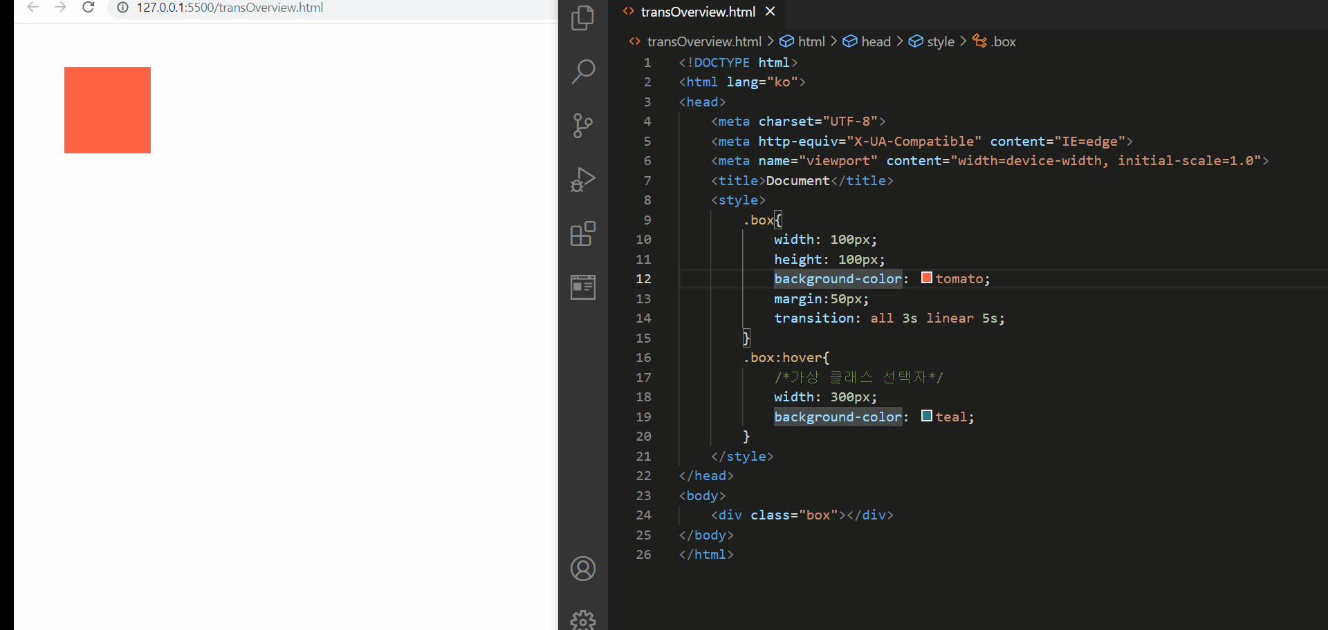
transition-delay
그 다음은 위에서 확인해볼 수 있는 전환에 대한 지연을 주는 transition-delay이다. 이 속성을 부여하게 되면 , 일정 시간 경과 후에 transition이 일어나게 되어서, 위의 경우에는 커서를 올려놓은 후 5초 후와 커서를 내린 후 5초 후에 transition이 일어남을 확인해볼 수 있다
🌟만약 transition:2s 3s로 기입한다면, 브라우저는 가장 먼저 온 시간을 duration, 뒤에 온 시간을 delay 시간으로인식하게 된다!
B. 변환! Transforms
- 요소의 변환 효과(변형)을 지정
[USAGE]
transform : 변환함수1 변환함수2 변환함수3 …;
예시) transform : 원근법 이동 크기 회전 기울임; 예시) .box{ transform: rotate(20deg) translate(10px, 0); }
🌟 변환 효과는 2D 변환 효과와 3D 변환 효과 모두 존재!
- 2D 변환 속성
🌟 matrix는 위의 모든 함수를 대체할 수 있다!
하나씩 직접 확인해보면서 익혀보자!
<!DOCTYPE html>
<html lang="ko">
<head>
    <meta charset="UTF-8">
    <meta http-equiv="X-UA-Compatible" content="IE=edge">
    <meta name="viewport" content="width=device-width, initial-scale=1.0">
    <title>Document</title>
    <style>
        .box{
            width: 100px;
            height: 100px;
            background-color: teal;
            margin:100px;
            transition:1s;
        }
        .box:hover{
            transform:rotate(45deg);
            background-color:yellow;
        }
    </style>
</head>
<body>
    <div class="box"></div>
</body>
</html>
transform rotate(deg)
위와 같이 가상 클래스 선택자 hover를 이용하여 transform:rotate()를 지정했을 때, 커서를 올리면 45도 회전이 되는 것을 확인해볼 수 있다
<!DOCTYPE html>
<html lang="ko">
<head>
    <meta charset="UTF-8">
    <meta http-equiv="X-UA-Compatible" content="IE=edge">
    <meta name="viewport" content="width=device-width, initial-scale=1.0">
    <title>Document</title>
    <style>
        *{
            padding:0;
            margin:0;
        }
        .box{
            width: 100px;
            height: 100px;
            background-color: teal;
            display:flex;
            justify-content: center;
            align-items: center;
            transition:1s;
        }
        .box:hover{
            transform:translate(100px,200px);
            background-color:yellow;
        }
    </style>
</head>
<body>
    <div class="box">123</div>
</body>
</html>
transform:translate, tranaslateX, translateY
위의 경우에는 translate가 어떤 기능을 수행하는지 확인해보고자 margin과 padding을 초기화해주었다. 먼저 translate(a,b)를 변환 효과로 지정하였을 때에는 x 축방향으로 100px & y 축 방향으로
그리고, 지금은 hover를 이용해서 올렸을 때 transform과 transition을 모두 부여해주었는데, 이는 설명하기 쉽게 기존 요소인 box에 대해서 설명을 접근해보면
<!DOCTYPE html>
<html lang="ko">
<head>
    <meta charset="UTF-8">
    <meta http-equiv="X-UA-Compatible" content="IE=edge">
    <meta name="viewport" content="width=device-width, initial-scale=1.0">
    <title>Document</title>
    <style>
        *{
            padding:0;
            margin:0;
        }
        .box{
            width: 100px;
            height: 100px;
            background-color: teal;
            display:flex;
            justify-content: center;
            align-items: center;
            position:relative;
            left:100px;
            top:200px;
        }
    </style>
</head>
<body>
    <div class="box">123</div>
</body>
</html>
position을 이용해서 위치를 조정한 것과 의미가 유사하다!
하지만, position은 배치하고만 끝! 의 의미가 강하고
transform의 translate는 요소를 언제든지 변경하고자 하는 의미가 강하다! 이는 hover를 통해서 확인해보았듯이, 요소의 위치를 자연스럽게 변경할 수 있다
물론
<!DOCTYPE html>
<html lang="ko">
<head>
    <meta charset="UTF-8">
    <meta http-equiv="X-UA-Compatible" content="IE=edge">
    <meta name="viewport" content="width=device-width, initial-scale=1.0">
    <title>Document</title>
    <style>
        *{
            padding:0;
            margin:0;
        }
        .box{
            width: 100px;
            height: 100px;
            background-color: teal;
            display:flex;
            justify-content: center;
            align-items: center;
            position:relative;
            left:0;
            top:0;
						transition:1s;
        }
         .box:hover{
            position:relative;
            left:100px;
            top:200px;
        }
    </style>
</head>
<body>
    <div class="box">123</div>
</body>
</html>
위와 같이 변환 전 요소에도 position을 넣고, 변환 후 요소에도 position을 넣으면 자연스럽게 위치가 변경될 수는 있지만, 번거로워질 뿐 아니라, 부하가 많아진다(이는 repainting하기 때문이라고 한다!)
🌟 transform은 애니메이션에 최적화되어 있고, 부하 문제도 적다!
다음은 요소의 크기를 변환해보자!
<!DOCTYPE html>
<html lang="ko">
<head>
    <meta charset="UTF-8">
    <meta http-equiv="X-UA-Compatible" content="IE=edge">
    <meta name="viewport" content="width=device-width, initial-scale=1.0">
    <title>Document</title>
    <style>
        *{
            padding:0;
            margin:0;
        }
        .box{
            width: 100px;
            height: 100px;
            background-color: teal;
            display:flex;
            justify-content: center;
            align-items: center;
            transition:3s;
        }
        .box:hover{
            transform:scale(3);
            background-color:yellow;
        }
    </style>
</head>
<body>
    <div class="box">123</div>
</body>
</html>

transform:scale,scaleX, scaleY
scale은 flex에서 확인했던 속성값 중 stretch가 생각나게 하는 것 같다
먼저 scale(배수)는 요소의 가로와 세로 너비를 배수만큼 늘이는데 이때 컨텐츠도 그 배수만큼 늘어나게 보인다
그리고 scaleX(배수)는 요소의 가로 너비를 배수만큼 늘이고, 그 때도 역시 컨텐츠가 가로 방향으로 배수만큼 늘어지게 보인다
scaleY(배수)는 요소의 세로 너비를 배수만큼 늘이고, 컨텐츠도 세로 방향으로 배수만큼 늘어지게 보인다
다만, 요소가 커질 때 margin 설정에 따라 일부분이 window 밖을 벗어나는 것처럼 보일 수 있다
<!DOCTYPE html>
<html lang="ko">
<head>
    <meta charset="UTF-8">
    <meta http-equiv="X-UA-Compatible" content="IE=edge">
    <meta name="viewport" content="width=device-width, initial-scale=1.0">
    <title>Document</title>
    <style>
        *{
            padding:0;
            margin:0;
        }
        .box{
            width: 100px;
            height: 100px;
            background-color: teal;
            display:flex;
            justify-content: center;
            align-items: center;
            transition:3s;
        }
        .box:hover{
            transform:translate(200px,100px) skewX(30deg,45deg);
            background-color:yellow;
        }
    </style>
</head>
<body>
    <div class="box">123</div>
</body>
</html>
transform-skew,skewX,skewY
위에서 확인한 것처럼 skew는 각도값을 인자로 주어서, x축으로 a deg만큼 y축으로 b deg 만큼 기울인 것 처럼 보이게 한다
그리고 skewX는 x축으로 a deg 만큼 기울인 것 처럼 보이게 하고, skewY는 y 축으로 b deg만큼 기울인 것처럼 보이게 한다
그리고 skew의 인자값으로는 음수값을 주어 방향을 바꿀 수도 있다!
🌟 위의 예제에서 본 것처럼, transform은 띄어쓰기를 통해서 여러 변환효과를 사용할 수 있다!
transform : 변환함수1 변환함수2;
- transform 3D 변환 함수
🌟 z축은 화면밖으로 튀어나오는 방향 혹은 들어가는 방향의 축!
🌟 perspective()는 transform의 가장 앞부분에 위치해야 한다!
<!DOCTYPE html>
<html lang="ko">

<head>
    <meta charset="UTF-8">
    <meta http-equiv="X-UA-Compatible" content="IE=edge">
    <meta name="viewport" content="width=device-width, initial-scale=1.0">
    <title>Document</title>
    <style>
        * {
            padding: 0;
            margin: 0;
        }

        img {
            width: 300px;
            border: 1px solid lightblue;
            transition:3s;
        }

        img:hover {
            transform: perspective(500px) translate3d(100px,100px,200px) rotate3d(0,0,1,-30deg);
        }
    </style>
</head>
<body>
    <img src="https://heropy.blog/css/images/logo.png" alt="heropy">
</body>

</html>
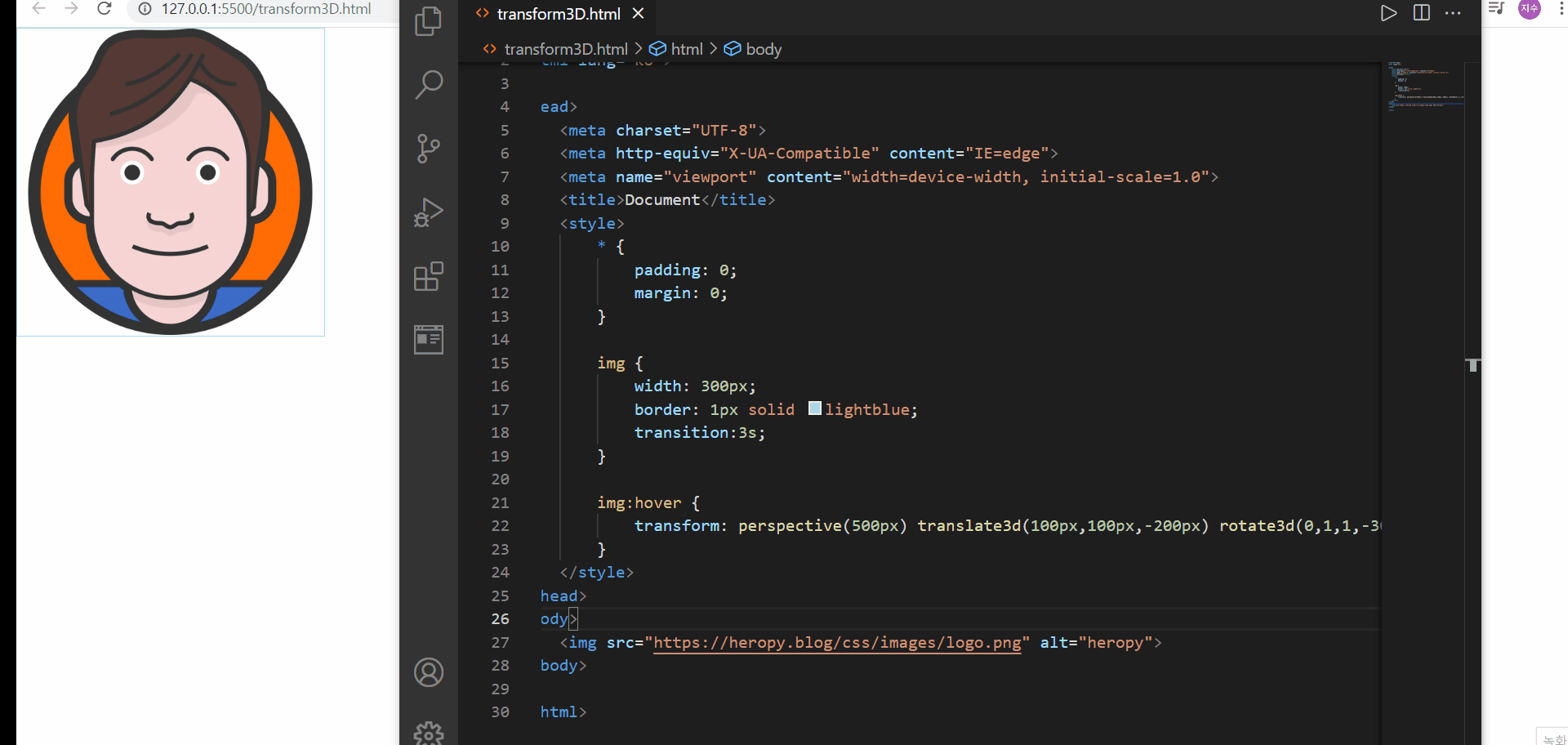
transform - 3d 속성
앞에서 언급했던 perspective 함수를 사용해야만 3d 변환의 효과를 확인해볼 수 있다.
먼저 perspective의 값으로 500px을 지정한 후, translate3d 속성의 z값을 변화해보았을 때, z축의 값이 음수이면 화면 안쪽으로 말려들어간 느낌이 들고, 양수이면 화면 밖으로 튀어나오는 듯한 입체감이 있다
그리고 rotate3d 함수의 벡터는 x y z 벡터가 있는데 해당 벡터가 1이면 그 축 방향으로 회전을 시키겠다는 의미가 있다
🌟 명시해야될 부분은 perspsective가 없으면 2d와 다를바가 없고, perspective 내의 수치가 높을 수록 더 멀리서 본다는 의미라서, 원근감이 떨어져 보일 수 있다
🌟 더더욱 명시해야할 부분은 perspective 속성이 뒤로 가면 원근감이 설정되지 않는다!라는 점이다
- transform 변환 속성
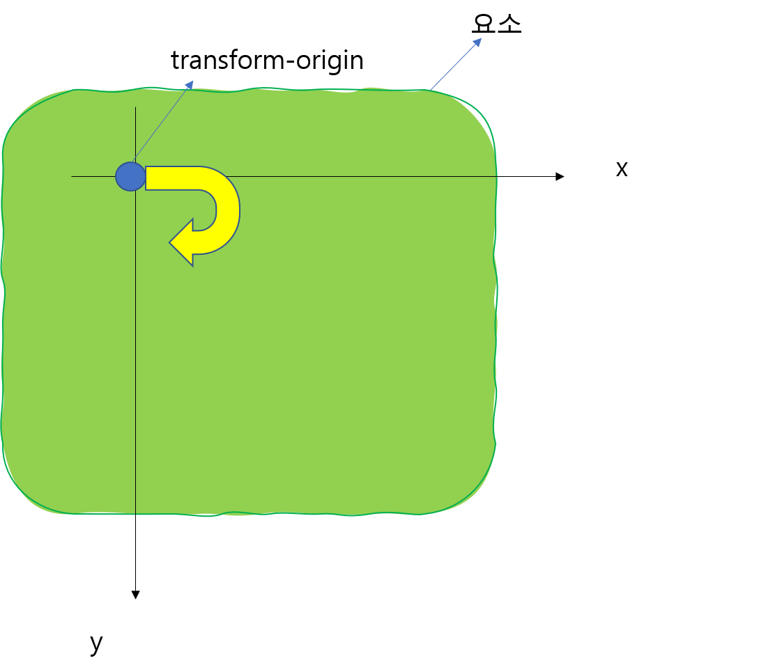
i. transform-origin
- 요소 변환의 기준점을 설정
🌟 ➡️ 위의 표에서 확인한 바와 같이 transform-origin은 기본적으로 요소의 정가운데를 기점으로 한다는 것을 알 수 있다!
<!DOCTYPE html>
<html lang="ko">
<head>
    <meta charset="UTF-8">
    <meta http-equiv="X-UA-Compatible" content="IE=edge">
    <meta name="viewport" content="width=device-width, initial-scale=1.0">
    <title>Document</title>
    <style>
        img{
            border:1px solid lightblue;
            width: 200px;
            transition:2s;
        }
        img:hover{
            transform-origin:50% 50% 0;
            transform:rotate(45deg);
        }
    </style>
</head>
<body>
    <img src="https://heropy.blog/css/images/logo.png" alt="HEROPY">
</body>
</html>
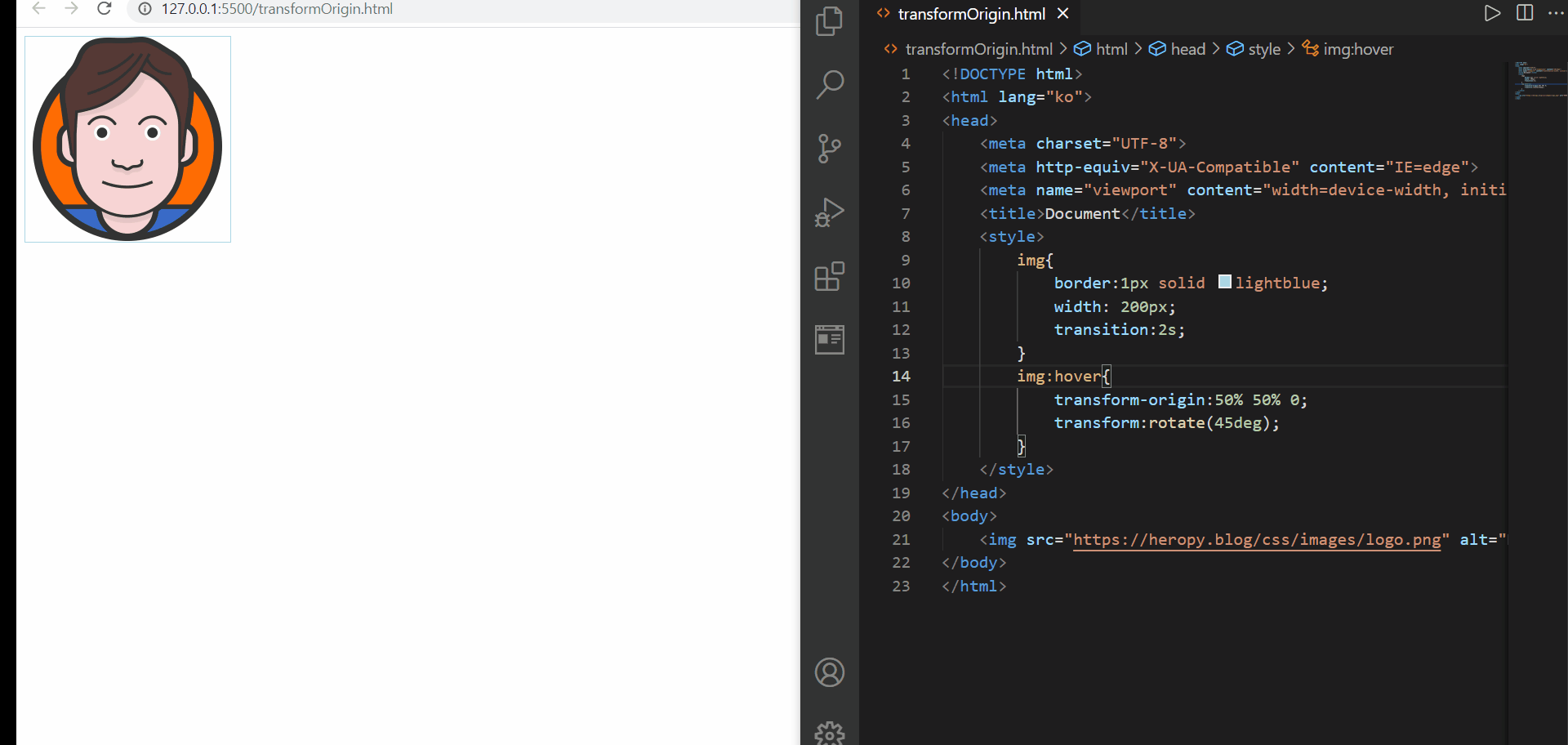
transform-origin
위의 예제에서 확인해볼 수 있던 것처럼,
1️⃣ transform-origin 속성이 없으면 그것은 transform-origin 50% 50% 0;과도 같다
2️⃣ transform-origin 속성값을 100% 50% 0;으로 변경하면, 우측 테두리 가운데 지점을 기준으로 transform을 진행하게 된다
3️⃣ 이것은 위와는 별도로 알고 있어야되는 부분이지만, 50% 50% 0은 지금 우리 입장에서 z축은 perspective 부재 등으로 인해서 불필요한 값이므로 굳이 0을 넣지 않고 50% 50%로만 적어도 된다!(위의 상황에서는)
추가로, 위에서 연습해본 rotate는 아래 그림처럼 브라우저의 축 구성 중 y축이 우리가 아는 방향과는 다르게 설정되어 있기 때문에, 기준점(transform-origin)을 기준으로 오른쪽 아랫방향으로 돌려지는 것처럼, 시계 방향으로 돌려지는 것처럼 보여진다
🌟 %는 아래 그림과 같이 수평은 왼쪽부터, 수직은 윗쪽부터 0% 개념을 잡고 각 축의 끝이 100%가 된다고 생각하면 된다!
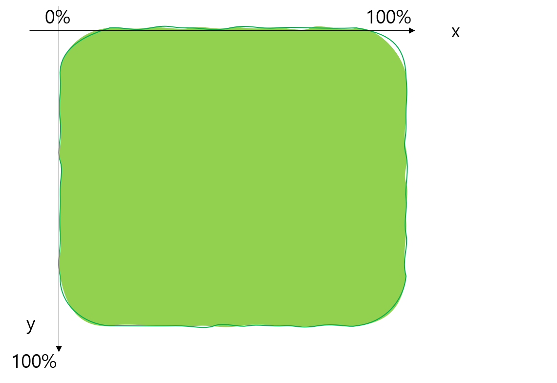
요소의 좌표개념
ii. transform-style
- 3D 변환요소의 자식요소도 3D 변환을 사용할지 설정
✴️ 퍼스펙티브 뷰(perspective view) : 원근감을 느낄 수 있는 브라우저의 관점
<!DOCTYPE html>
<html lang="ko">
<head>
    <meta charset="UTF-8">
    <meta http-equiv="X-UA-Compatible" content="IE=edge">
    <meta name="viewport" content="width=device-width, initial-scale=1.0">
    <title>Document</title>
    <style>
        .perspective{
            perspective: 500px;
            width: 200px;/*전체 뷰포트의 정중앙에서 바라보게 되는데,
            그렇기 때문에 perspective의 가로너비도 grand-parent와
            일치해주어야 함*/
            padding:70px;
        }
        .grand-parent{
            width: 200px;
            border:3px solid dodgerblue;
            transition:1s;
            transform:rotateX(-45deg);
            transform-style:preserve-3d;
        }
        .parent{
            width: 200px;
            border: 3px solid pink;
            transition:1s;
            transform:rotateY(45deg);
            transform-style:preserve-3d;
        }
        img{
            width: 200px;
            border:3ps solid lightslategray;
            transition:1s;
            transform:rotateX(45deg);
        }
    </style>
</head>
<body>
    <div class="perspective">
        <div class="grand-parent">
            <div class="parent">
                <img src="https://heropy.blog/css/images/logo.png" alt="HEROPY">
            </div>
        </div>
    </div>
</body>
</html>
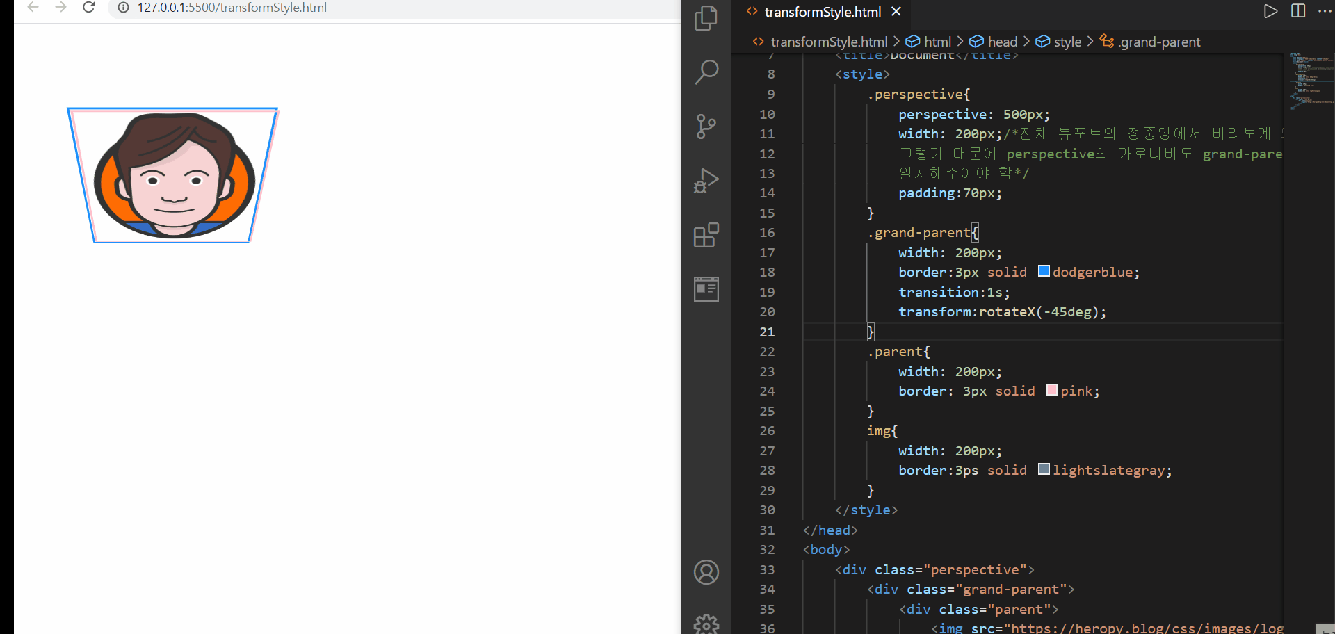
transform-style
위에서 나온 perspective 속성은 뒤에서 다룰 것이니 걱정하지 말고 단지 원근감을 조성한다는 점만 알고 이해해보자
먼저 위의 예제에서는 3D 속성을 부여하는 속성에 대해서는 perspective를 이용하여 클래스명이 perspective인 요소에 부여해두었다. 그런데 이를 그의 하위 요소들에서 사용하고 싶은데, 단순히 transform 이나 transition을 적용해도 2D 변환의 느낌만이 난다. 이는 transform-style:flat; 이라는 속성-속성값이 기본설정되어 있기 때문에 아무리 원하는 방향이 있어도 적용이 되지 않은 것이다
따라서 3D 속성을 물려받고 싶은 경우에는 3D 속성을 물려받고 싶은 요소의 부모요소에 transform-style:preserve-3d를 명시해주면 된다. 위의 경우, parent요소와 img 요소에서 3D속성을 물려받고 싶었기 때문에 grand-parent요소와 parent 요소에 해당 속성을 기재해주었다
iii. perspective
- 하위 요소를 관찰하는 원근 거리를 설정
🌟 perspective 함수와 비교!
가. perspective 함수 :
화면으로부터 변환 대상 요소를 관찰하는 원근 거리를 설정
나. perspective 속성 : 하위요소를 관찰하는 원근 거리를 설정
위에서 살펴보았던 코드를 이제 이 개념을 접목해본다면, perspective 요소가 하위요소와 500px 만큼 떨어진 거리에서 바라보고 있는 것이다
만약, 이 값을 키운다면, 거리감이 멀어져서 사이즈가 줄어들어보일 수도 있지만, 그 값이 너무 커지면 원근감이 없어보이기 때문에 이 부분은 조심해야 한다
반대로 perspective 값을 줄인다면, 위의 예시에서 바라본 것보다 가까워보일 수 있다
🌟 원근감을 적용할 요소의 상위 요소에 perspective 속성을 지정해주어야 한다
<!DOCTYPE html>
<html lang="ko">
<head>
    <meta charset="UTF-8">
    <meta http-equiv="X-UA-Compatible" content="IE=edge">
    <meta name="viewport" content="width=device-width, initial-scale=1.0">
    <title>Document</title>
    <style>
        .grand-parent{
            width: 100px;
            height: 100px;
            background-color: lightyellow;
            border:1px solid gainsboro;
            perspective:500px;
            transform-style:preserve-3d;
        }
        .parent{
            width: 100px;
            height: 100px;
            background-color: gold;
            border:1px solid pink;
            transition:1s;
            transform:rotateY(30deg);
            transform-style:preserve-3d;
        }
        .child{
            width: 100px;
            height: 100px;
            background-color: dodgerblue;
            transition:1s;
            transform:rotateZ(30deg);
        }
    </style>
</head>
<body>
    <div class="grand-parent">
        <div class="parent">
            <div class="child"></div>
        </div>
    </div>
</body>
</html>
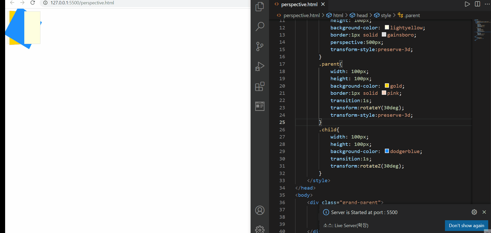
perspective 속성
위에서는 perspective 값에 따른 원근감을 확인해볼 수 있다. 원래 처음 시작 시 설정했던 500px 보다 거리가 더 가까워졌을 때에는 화면 밖으로 튀어나오는 듯한 느낌을 받을 수 있다. 하지만 그 값이 더 커졌을 때에는 변동이 없는 것처럼 느껴질 수 있지만, 사실상은 거리가 더 멀어졌기 때문에 그 원근감을 느끼지 못하는 것이다
iv. perspective-origin
- 원근 거리의 기준점을 설정
🌟 위의 표에서 확인해볼 수 있듯이, perspective-origin 즉 원근 거리의 기준점은 perspecitve 속성을 지정한 요소의 정중앙이 되는 것!
🌟 %단위의 좌표에 대한 적용 개념은 transform-origin과 유사하다! 그리고 그 값이 100%보다 클 수 있다!
<!DOCTYPE html>
<html lang="ko">
<head>
    <meta charset="UTF-8">
    <meta http-equiv="X-UA-Compatible" content="IE=edge">
    <meta name="viewport" content="width=device-width, initial-scale=1.0">
    <title>Document</title>
    <style>
        .perspective{
            perspective-origin: 200% 100%;
            perspective: 500px;
            width: 200px;/*전체 뷰포트의 정중앙에서 바라보게 되는데,
            그렇기 때문에 perspective의 가로너비도 grand-parent와
            일치해주어야 함*/
            padding:70px;
        }
        .grand-parent{
            width: 200px;
            border:3px solid dodgerblue;
            transition:1s;
            transform:rotateX(-45deg);
            transform-style:preserve-3d;
        }
        .parent{
            width: 200px;
            border: 3px solid pink;
            transition:1s;
            transform:rotateY(45deg);
            transform-style:preserve-3d;
        }
        img{
            width: 200px;
            border:3ps solid lightslategray;
            transition:1s;
            transform:rotateX(45deg);
        }
    </style>
</head>
<body>
    <div class="perspective">
        <div class="grand-parent">
            <div class="parent">
                <img src="https://heropy.blog/css/images/logo.png" alt="HEROPY">
            </div>
        </div>
    </div>
</body>
</html>

perspective-origin
이번에는 transform-style에서 사용했던 예제를 그대로 이용하여 확인해보도록 하였다
위에서 확인해볼 수 있었던 점은
1️⃣ perspective-origin값을 지정하지 않았어도 perspective-origin:50% 50%;가 기본값으로 지정되어 적용되었다
2️⃣ perspective-origin값은 꼭 값이 100%가 아니더라도 가능하며, 그 값에 따라 보는 시선이 달라진다
라는 점이었다!
v. backface-visibility
- 3D 변환으로 회전된 요소의 뒷면 숨김을 설정
backface-visibility 속성의 의미를 확인하자마자, 생각난 것은 간혹 사이트에 보면 재미있는 플립효과를 준 경우가 있었는데(마우스를 올리면 디테일한 설명이 보여지는 효과) 그 부분을 연습해보고자 아래의 예제를 진행해보았다
<!DOCTYPE html>
<html lang="ko">
<head>
    <meta charset="UTF-8">
    <meta http-equiv="X-UA-Compatible" content="IE=edge">
    <meta name="viewport" content="width=device-width, initial-scale=1.0">
    <title>Document</title>
    <style>
        *{
            padding:0;
            margin:0;
        }
        div{
            width: 100%;
            height: 100%;
        }
        .container{
            margin:10px;
            width: 300px;
            height: 300px;
            perspective:800px;
        }
        .card{
            position:relative;
            transition:3s;
            transform-style:preserve-3d;
            cursor:pointer;
        }
        .front,
        .back{
            position:absolute;
            display:flex;
            justify-content: center;
            align-items: center;
            background-color: lightgreen;
            border:2px solid lightblue;
            color:white;
            font-weight: bold;
            backface-visibility: hidden;
        }
        .back{
            transform:rotateY(180deg);
        }
    </style>
</head>
<body>
    <div class="container">
        <div class="card">
            <div class="front">Front</div>
            <div class="back">
                Back
            </div>
        </div>
    </div>
    <script>
        const card= document.querySelector(".card");

        function mouseOver(e){
            let target = e.currentTarget;

            if(target.style.transform ==='rotateY(180deg)'){
                target.style.transform=`rotateY(0deg)`;
            }else{
                target.style.transform='rotateY(180deg)';
            }
        }

        function mouseLeave(e){
            let target = e.currentTarget;

            if(target.style.transform ==='rotateY(180deg)'){
                target.style.transform=`rotateY(180deg)`;
            }else{
                target.style.transform='rotateY(0deg)';
            }
        }

        card.addEventListener("mouseover",mouseOver);
        card.addEventListener("mouseleave",mouseLeave);
    </script>
</body>
</html>
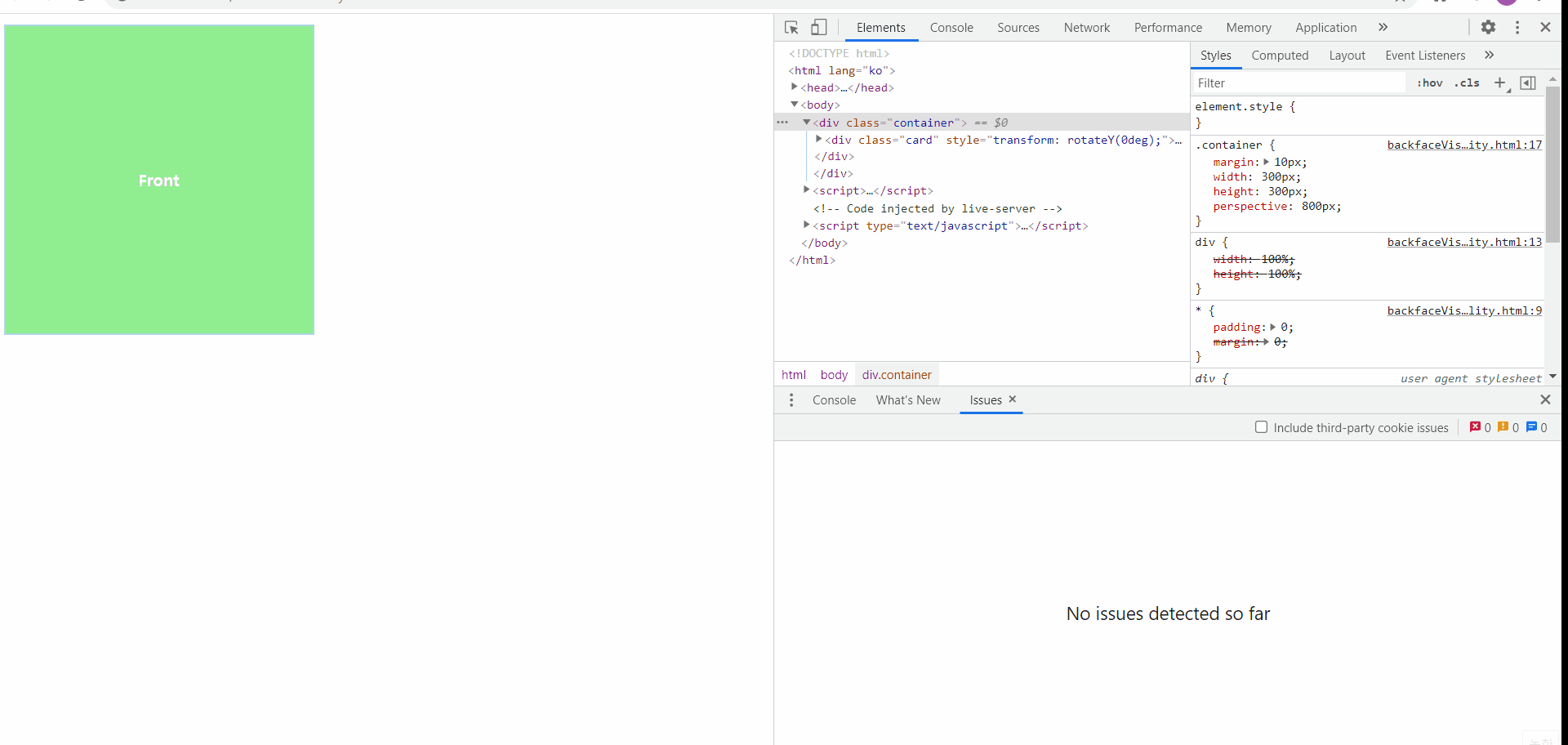
backface-visibility
플립효과를 준 방식을 나중에도 연습해보기 위해서 기록해두자면
1️⃣ 앞면과 뒷면을 묶어줄 부모요소를 만든다(위에서는 card 클래스)
2️⃣ 1️⃣에서 만든 요소에 3D 입체 효과를 주기 위한 용도로 최상위 조상요소를 만든다(위에서는 container 클래스)
3️⃣ 2️⃣에서 만든 최상위 조상 요소에서는 원근 거리를 설정하고, 1️⃣에서 만든 요소에서는 transform-style:preserve-3d를 통해서 하위 요소들에게도 3D 입체 효과를 물려준다
4️⃣ 모든 하위 요소에서는 부모 요소의 너비를 기반으로 100% 너비를 사용할 수 있도록 지정한다!
5️⃣ 뒷면 요소에 대해서만 transform을 지정해주고, 앞면에는 transform 속성을 지정하지 않는다(CSS)
6️⃣ 자바스크립트를 이용해서 마우스 동작에 따라서 이벤트 대상의 style.transform(transform 속성)의 값이 어떤 상태일때 그 상태를 어떻게 바꿀 것인지 핸들러 함수로 작성
위와 같이 세부적인 단계로 플립효과를 지정하게 되면 마우스를 올리거나 내렸을 때, 동전이 뒤집히는 모양새와 같이 작동됨을 확인해볼 수 있다!
vi. matrix
a] matrix(a,b,c,d,e,f)
- 요소의 2차원 변환 효과를 지정
- scale(), skew(), translate(), rotate() 를 지정
🌟 요소에 일반 변환 함수(앞에서 다루어졌던 함수들)을 사용해도 브라우저에 의해서 matrix 함수로 계산되어 적용된다!(2D 변환함수는 matrix, 3D 변환함수는 matrix3d로) 따라서 일반적인 경우에는 matrix 함수가 아닌 일반 변환 함수를 사용하면 된다![matrix보다 직관적이고 사용하기에 용이-matrix3d는 총 16개 인자(인수)를 필요로 함!!]
- 브라우저 입장에서는 최적화할 수 있는 함수
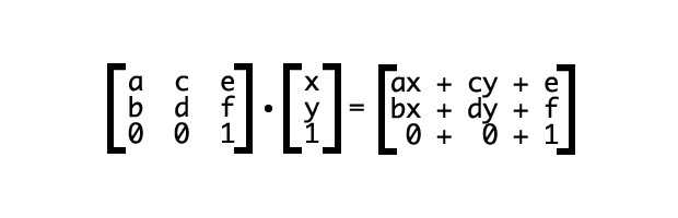
https://dev.opera.com/articles/understanding-the-css-transforms-matrix/
- 2차원 matrix는 위의 사이트에서 보는 것처럼 왼쪽 상단부터 지그재그로 구성되어있으며, 각 자리는 함수에 따라서 값이 계산되어 적용될 수 있다!