1_[css]화면을 조금 더 화려하게 꾸며주는 animation
CSS-애니메이션
animation 속성
- 요소에 애니메이션을 설정/제어
- 단축, 개별 속성 지원
@는 “at”이라고 명명한다!
[USAGE]
animation: 애니메이션이름 지속시간 [타이밍함수 대기시간 반복횟수 반복방향 전후상태 재생/정지];
(예시)
.box{
	width:100px;
	height:100px;
	background:tomato;
  animation: **hello** 2s linear infinite both;
}

@keyframes **hello**{
	0% { width:200px;}
	100%{width:50px;}
}
🌟 애니메이션은 keyframes로 명명된 일종의 규칙에 근거한 애니메이션을 채용한다!
🌟 keyframes는 이름을 가진다!
🌟 %를 통해서 프레임을 설정할 수 있는데, 첫번째는 0%!
간단한 예제를 통해서 체득해보자!
<!DOCTYPE html>
<html lang="ko">
<head>
<meta charset="UTF-8">
<meta http-equiv="X-UA-Compatible" content="IE=edge">
<meta name="viewport" content="width=device-width, initial-scale=1.0">
<title>Document</title>
<style>
.box{
width: 100px;
height: 100px;
background-color: tomato;
}
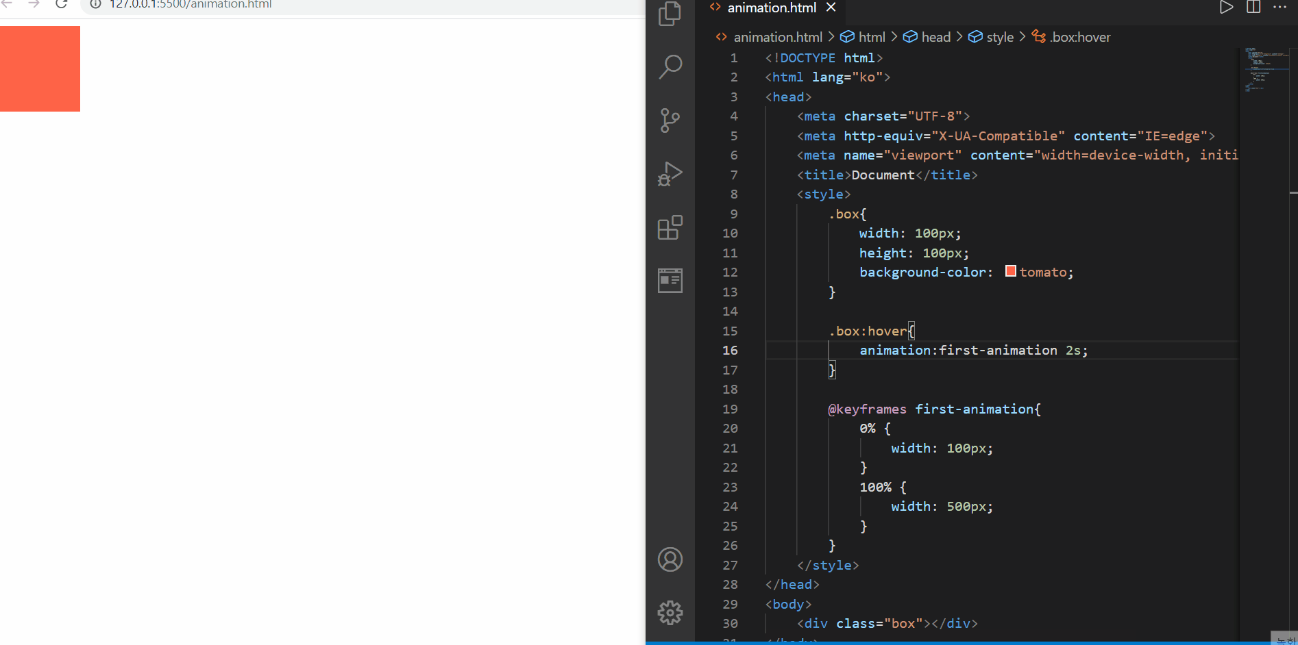
.box:hover{
animation:first-animation 2s;
}
@keyframes first-animation{
0% {
width: 100px;
}
100% {
width: 500px;
}
}
</style>
</head>
<body>
<div class="box"></div>
</body>
</html>
animation
animation에서 중요한 것은 위에서 언급한 keyframes 규칙뿐 아니라, 이를 얼마동안 지속하는지도 언급해주는 것이 중요하다
그 이유는 기본적으로 animation-duration이 0s로 지정되어 있기 때문에, 이 속성값을 지정해주지 않는다면 ‘음..왜 애니메이션 효과가 나타나지 않지..?’라고 생각할 수도 있다!
위에서는 0%였을때(처음)과 100%(마지막) 단계 딱 2단계에 대해서 변화된 가로 너비를 2초동안 보여주는데 마우스커서를 올린 후 별도의 액션이 없어도 단 1회만 애니메이션을 한 후 원래의 모습으로 돌아가는 것을 확인해볼 수 있다
왜 1회만일까? 그 이유는 animation-iteration-count라는 반복횟수 값의 기본값은 1로 지정되어 있기 때문이다!
그렇다면 무한번 반복하고 싶다면? 이 값을 infinite로 바꾸어주면 되고, 만약 2회 이상, 유한번 반복하고 싶다면 10 과 같은 값을 넣어주면 된다
<!DOCTYPE html>
<html lang="ko">
<head>
<meta charset="UTF-8">
<meta http-equiv="X-UA-Compatible" content="IE=edge">
<meta name="viewport" content="width=device-width, initial-scale=1.0">
<title>Document</title>
<style>
.box{
width: 100px;
height: 100px;
background-color: tomato;
}
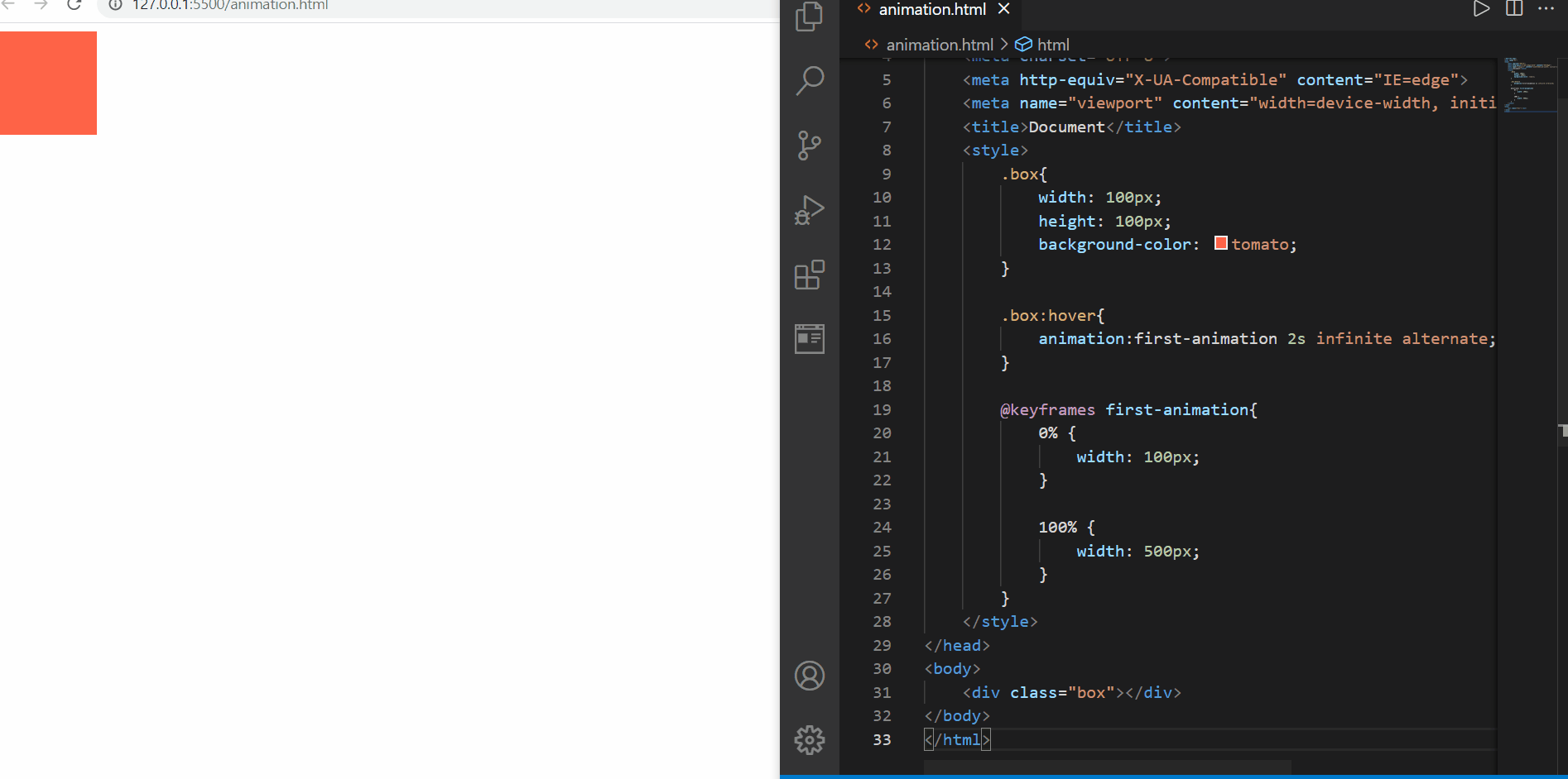
.box:hover{
animation:first-animation 2s infinite;/*반복횟수 animation-iteration-count*/
}
@keyframes first-animation{
0% {
width: 100px;
}
100% {
width: 500px;
}
}
</style>
</head>
<body>
<div class="box"></div>
</body>
</html>

animation-iteration-count
위와 같이
요소{ animation: 애니메이션이름 지속시간 반복횟수; }
에서 반복횟수를 infinite로 지정하게 되면, 기존에 transition이나 transform 등에서 확인했던 hover와 같은 동작을 할때 마다가 아닌, 한번 우선 일단 동작이 일어나고 그 이후 그 상태를 유지하고 있다면, 계속 쭉~~!! 애니메이션을 수행함을 알 수 있고, 그 동작의 영역에서 벗어나면 동작을 멈추는 것을 알 수 있다!
즉, 위의 경우, 요소 위에 커서를 올려두기만 하면 그 요소를 벗어나기 전까지 계속 요소 크기가 커지는 애니메이션을 보여주게 된다!
그런데 뭔가 원상태로 돌아가는 과정이 부드럽지가 않다!
늘어날때도 줄어들때에도 부드럽게 동작시키고 싶다!
그 이유는 animation-direction의 기본값이 normal로 되어있기 때문에 단방향성으로 작동되는 것이다!
이를 alternate 값(양방향성)으로 바꾸어 준다면 아래와 같이 줄어들 때에도 부드럽게 애니메이션하는 것을 볼 수 있다!
<!DOCTYPE html>
<html lang="ko">
<head>
    <meta charset="UTF-8">
    <meta http-equiv="X-UA-Compatible" content="IE=edge">
    <meta name="viewport" content="width=device-width, initial-scale=1.0">
    <title>Document</title>
    <style>
        .box{
            width: 100px;
            height: 100px;
            background-color: tomato;
        }

        .box:hover{
            animation:first-animation 2s infinite alternate;
        }

        @keyframes first-animation{
            0% {
                width: 100px;
            }

            100% {
                width: 500px;
            }
        }
    </style>
</head>
<body>
    <div class="box"></div>
</body>
</html>
animation-direction
🌟 animation 속성이 실질적인 프레임을 만드는 것이 아닌, 우리가 만든 프레임을 제어한다는 것을 명시해야 한다!
이제 각각에 대해서 조금 더 알아보자!
📌Keyframe(@keyframes) rule 📌
- 2개 이상의 애니메이션 중간 상태(프레임)을 지정
- 프레임들의 그룹은 animation 속성을 통해서 제어할 수 있음
@keyframes 애니메이션이름{
	0% { 속성:값;}
 50% { 속성:값;}
100% { 속성:값;}

}

@keyframes move-box{
	0% {left:100px;}
100% { top:200px;}
}
🌟 트랜지션, 트랜스폼은 0%, 100%일 때를 지정하는 애니메이션인데 반해서, animation은 중간 단계에 대해서 다양한 제어가 가능하다!
<!DOCTYPE html>
<html lang="ko">
<head>
    <meta charset="UTF-8">
    <meta http-equiv="X-UA-Compatible" content="IE=edge">
    <meta name="viewport" content="width=device-width, initial-scale=1.0">
    <title>Document</title>
    <style>
        .box{
            width: 100px;
            height: 100px;
            background-color: tomato;
            border-radius:10px;
        }

        .box:hover{
            animation:my-animation 3s infinite alternate;
        }
        @keyframes my-animation{
            0% {
                width:100px;
                background-color: tomato;
            }
            25% {
                width:325px;
                background-color: lightskyblue;
            }
            50%{
                width:550px;
                background-color: lightsteelblue;
            }
            75%{
                width:775px;
                background-color: dodgerblue;
            }
            100% {
                width:1000px;
                background-color: indigo;
            }
        }
    </style>
</head>
<body>
    <div class="box"></div>
</body>
</html>
keyframes rules
위의 경우처럼, animation은 중간 단계 (예: 25% )에 대해서도 화면상에서 어떤 모습을 보여줄 지를 결정해줄 수 있다!
위의 경우에는 프레임 단계 수치가 25% 씩 증가했을 때, 처음과 끝 뿐아니라 중간단계에서 배경 색상과 함께 너비가 변경되는 모습을 볼 수 있다
➕ 0%는 from, 100%는 to로 대체하여 사용할 수도 있다!
🌺 animation의 개별속성 🌺
- animation-name
- @keyframes 규칙(애니메이션 프레임)의 이름을 지정
- animation-duration
- 애니메이션의 지속시간 설정
- s, ms 단위 지원
<!DOCTYPE html>
<html lang="ko">
<head>
<meta charset="UTF-8">
<meta http-equiv="X-UA-Compatible" content="IE=edge">
<meta name="viewport" content="width=device-width, initial-scale=1.0">
<title>Document</title>
<style>
.box{
width: 100px;
height: 100px;
background-color: tomato;
border-radius:10px;
}
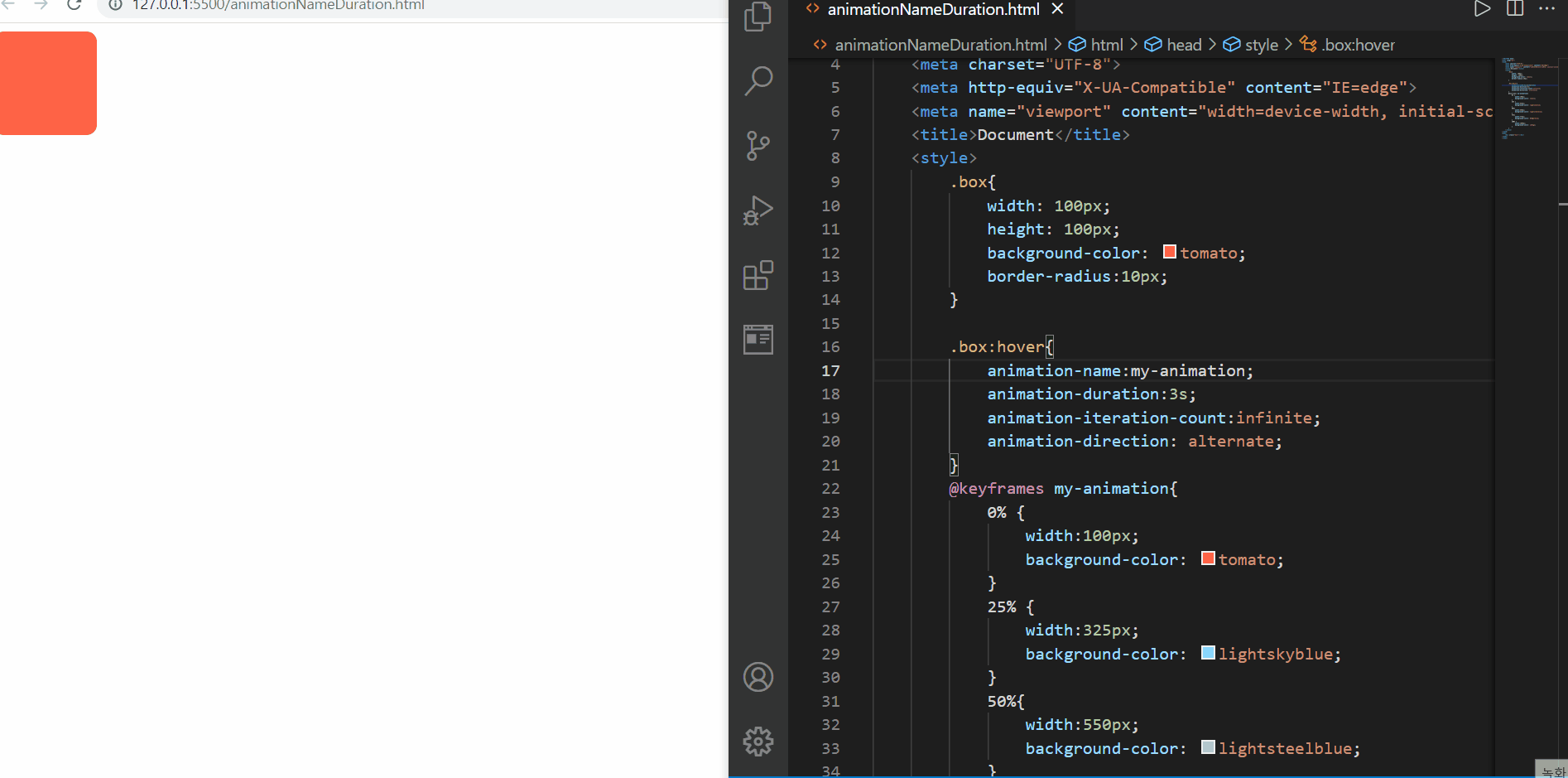
.box:hover{
animation-name:my-animation;
animation-duration:10000ms;
animation-iteration-count:3;
animation-direction: alternate;
}
@keyframes my-animation{
0% {
width:100px;
background-color: tomato;
}
25% {
width:325px;
background-color: lightskyblue;
}
50%{
width:550px;
background-color: lightsteelblue;
}
75%{
width:775px;
background-color: dodgerblue;
}
100% {
width:1000px;
background-color: indigo;
}
}
</style>
</head>
<body>
<div class="box"></div>
</body>
</html>
animation-name, animation-duration
위에서 살펴볼 수 있는 점은
1️⃣ animation-name:none 을 설정함으로써 애니메이션이 실행되지 않는다
2️⃣ animation-duration을 변경하면 그 시간만큼 수행될 수 있도록 변경될 수 있고, ms 단위가 지원된다
3️⃣ 뒤에서 배울 속성값이지만 animation-iteration-count:3 을 지정하면, 마우스를 올리면 기본 3번(증가하는 방향 1번, 감소하는 방향 1번, 증가하는 방향 1번 ➡️ 원위치, 원상태로 ) 애니메이션을 수행하게 된다
라는 점이 주목할 만 하다
- animation-timing-function
- transition-timing-function과 동일!
- 타이밍 함수(애니메이션 효과를 계산하는 방법) 지정
<!DOCTYPE html>
<html lang="en">

<head>
    <meta charset="UTF-8">
    <meta http-equiv="X-UA-Compatible" content="IE=edge">
    <meta name="viewport" content="width=device-width, initial-scale=1.0">
    <title>Document</title>
    <style>
        p {
            line-height: 2;
            font-size: 20px;
            animation-name: slideIn;
            animation-duration: 6s;
            animation-timing-function:cubic-bezier(0.455, 0.03, 0.515, 0.955);
            animation-direction: alternate;
            animation-iteration-count: infinite;
        }

        @keyframes slideIn {
            from {
                margin-left: 100%;
                width: 300%;
            }

            to {
                margin-left: 0%;
                width: 100%;
            }
        }
    </style>
</head>

<body>
    <p>Bacon ipsum dolor amet corned beef cow tri-tip, pork loin tail meatloaf jowl sirloin turducken jerky turkey
        tenderloin kevin burgdoggen pork belly. Pork chop chuck tail, shank meatball kevin beef chislic corned beef ball
        tip doner buffalo bresaola. </p>
</body>
</html>
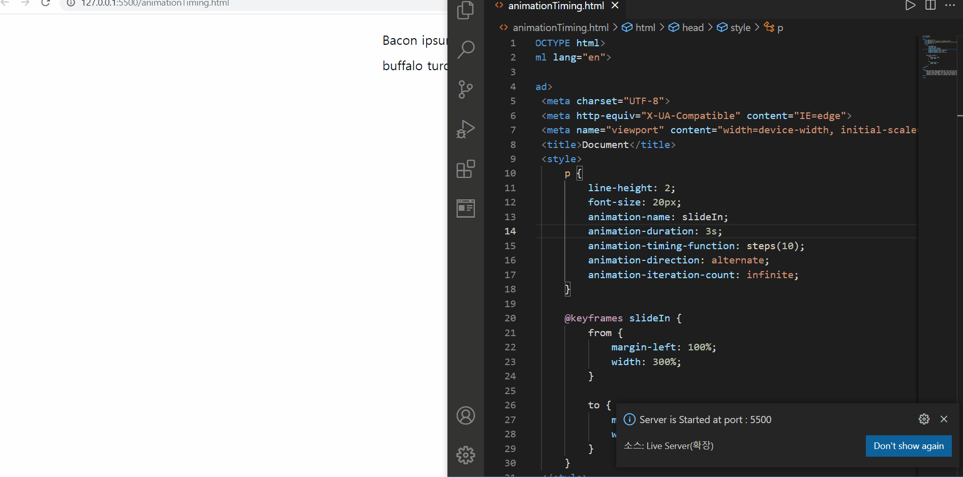
animation-timing-function
먼저 steps를 이용한 값을 넣어주었을 경우에는 뚝뚝 끊어지는 느낌이 들면서 문장이 등장하게 되고, linear를 설정해주면, 일정 속도만큼 동일하게 진행하고, ease-in은 처음에 등장할때에는 느렸는데 점차 빨라지는 모습이 보였다
그리고 cubic-beizer 함수를 적용하였을 때에도 이에 해당되는 타이밍 조절이 가능할 수 있음을 확인하였다
- animation-delay
- 애니메이션의 대기 시간 설정
🌟 음수가 허용되기는 하지만 , 음수인 경우 애니메이션 주기 도중에 시작한다는 의미가 있음(애니메이션이 앞서 시작됨)
<!DOCTYPE html>
<html lang="ko">

<head>
    <meta charset="UTF-8">
    <meta http-equiv="X-UA-Compatible" content="IE=edge">
    <meta name="viewport" content="width=device-width, initial-scale=1.0">
    <title>Document</title>
    <style>
        * {
            padding: 0;
            margin: 0;
        }

        .box {
            width: 150px;
            height: 100px;
            border-radius: 10px;
            margin: 10px;
            display: flex;
            justify-content: center;
            align-items: center;
            color: darkblue;
            font-size: 30px;
            font-weight: bold;
        }

        .box1 {
            background-color: lightseagreen;
        }

        .box1:hover {
            animation: size-up 1s 2 alternate linear 0s;
        }

        .box2 {
            background-color: lightblue;
        }

        .box2:hover {
            animation: size-up 1s 2 alternate ease-in 1s;
        }

        .box3 {
            background-color: dodgerblue;
        }

        .box3:hover {
            animation: size-up 1s 2 alternate ease-in-out -1s;
        }

        @keyframes size-up {
            from {
                width: 150px;
            }

            to {
                width: 500px;
            }
        }
    </style>
</head>
<body>
    <div class="box box1">0s</div>
    <div class="box box2">1s</div>
    <div class="box box3">-1s</div>
</body>
</html>
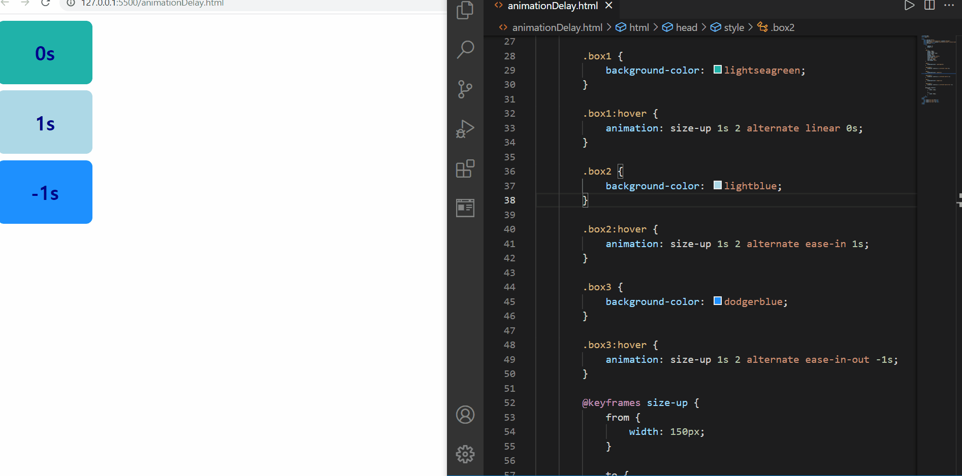
animation-delay
delay의 경우 다른 것보다, 음수 값일 때가 살펴볼만 한데
지금 방향은 양방향성 alternate로 from 1초, to 1초로 총 2초 의 애니메이션이 진행되어야 하는데,
음수값 -1s가 들어감으로써 from, 즉 앞의 1초는 묵시되고 to의 1초만이 애니메이션되는 것을 확인해볼 수 있다!
즉, animation-delay값으로 음수가 들어간다면 그 시간만큼의 애니메이션은 스킵되고 그 이후의 애니메이션이 진행된다!
🌟 delay 시간값은 duration 시간값보다 뒤에만 등장하면 되어서,
animation: size-up 1s 2 alternate 0s linear;
와 같이 적용해도 동일한 애니메이션 효과를 볼 수 있다!
- animation-iteration-count
- 애니메이션의 반복 횟수 설정
animation-iteration-count의 속성값
- animation-direction
- 애니메이션의 반복 방향을 설정
✴️ 정방향 : 0% ➡️ 100% 프레임 순 진행
✴️ 역방향 : 100% ➡️ 0% 프레임 순 진행
<!DOCTYPE html>
<html lang="ko">
<head>
    <meta charset="UTF-8">
    <meta http-equiv="X-UA-Compatible" content="IE=edge">
    <meta name="viewport" content="width=device-width, initial-scale=1.0">
    <title>Document</title>
    <style>
        *{
            padding:0;
            margin:0;
        }
        .box{
            width: 300px;
            height: 100px;
            border-radius:20px;/*border-style:none이 기본값*/
            margin:10px;
            color:white;
            text-shadow:0 0 10px darkblue;
            font-size:30px;
            font-weight:bold;
            display:flex;
            justify-content: center;
            align-items:center;

        }
        .box1{
            background-color: lightskyblue;
        }

        .box1:hover{
            animation-name:trans;
            animation-duration:2s;
            animation-iteration-count: infinite;
            animation-direction:normal;
        }
        .box2{
            background-color: lightseagreen;

        }
        .box2:hover{
            animation-name:trans;
            animation-duration:2s;
            animation-iteration-count: infinite;
            animation-direction:reverse;
        }

        .box3{
            background-color: lightpink;
        }

        .box3:hover{
            animation-name:trans;
            animation-duration:2s;
            animation-iteration-count: infinite;
            animation-direction:alternate;
        }

        .box4{
            background-color: lightgreen;

        }

        .box4:hover{
            animation-name:trans;
            animation-duration:2s;
            animation-iteration-count: infinite;
            animation-direction:alternate-reverse;
        }
        @keyframes trans{
            0% {
                transform:rotate(45deg);
            }
            50%{
                transform:translateX(300px);
            }
            100%{
                transform:translateY(500px);
            }
        }
    </style>
</head>
<body>
    <div class="box box1">normal</div>
    <div class="box box2">reverse</div>
    <div class="box box3">alternate</div>
    <div class="box box4">alternate-reverse</div>
</body>
</html>
iteration 관련해서는 여러번 확인해보았기 때문에 direction만 추가로 확인할 필요가 있어서 4개 속성값을 확인하기 위한 요소를 미리 만들어두고, transform을 프레임마다 다르게 지정해주어 재미있게 확인해보았다
%20%EC%A7%80%EC%A0%95.gif?raw=true)
animation-iteration-count, animation-direction
지정한 애니메이션은 프레임 정방향 순으로는 아래와 같다
1️⃣ 요소의 정중앙 지점을 기준으로 45도 시계방향으로 회전
2️⃣ X축 방향으로 300px 지점으로 이동
3️⃣ Y축 방향으로 500px 지점으로 이동
그렇다면 역방향은 아래와 같을 것이다
1️⃣ Y축 방향으로 500px 지점으로 이동
2️⃣ X축 방향으로 300px 지점으로 이동
3️⃣ 요소의 정중앙 지점을 기준으로 45도 시계방향으로 회전
그리고 무한 반복을 하고 싶어서 animation-iteration-count값은 infinite로 지정해두었다
그 결과, normal일 때에는 정방향으로 “rotate → tranlateX → translateY “를 반복하고
reverse은 역방향으로, “translateY → translateX → rotate”를 반복하고
alternate는 정방향 후 역방향으로, “rotate → tranlateX → translateY →translateX→rotate”를 반복하고
alternate-reverse는 역방향 후 정방향으로 , “translateY → translateX → rotate→translateX → translateY”를 반복하는 것처럼 보인다
alternate-xxx의 경우 “왜 정방향과 역방향 사이 전환에서 100% 혹은 0% 지점의 행동이 생략되었나?”라고 생각할 수도 있는데, 이미 해당 프레임 단계에 있어서, 그 부분이 우리가 확인했을 때에는 위와 같은 순서로 보이겠지만 실제로는
alternate는 정방향 후 역방향으로, “rotate → tranlateX → translateY → translateY →translateX→rotate”
alternate-reverse는 역방향 후 정방향으로 , “translateY → translateX → rotate→rotate→translateX → translateY”
를 정확하게 수행하고 있는 것이다!
🌟 정방향 ↔️ 역방향 을 반복하는 alternate-xxx는 방향을 소비하기 때문에 정방향1회, 역방향 1회를 수행시키기 때문에 반드시 animation-iteration-count를 짝수번으로, 최소 2회 이상으로 지정해주어야 한다!
(그렇지 않으면 alternate는 정방향만 alternate-reverse는 역방향만 1회 수행하게 된다)
- animation-fill-mode
- 애니메이션의 전후 상태(위치)를 정의
자세한 정리 전, 가볍게 맛보기 예제를 실행해보자
<!DOCTYPE html>
<html lang="ko">
<head>
    <meta charset="UTF-8">
    <meta http-equiv="X-UA-Compatible" content="IE=edge">
    <meta name="viewport" content="width=device-width, initial-scale=1.0">
    <title>Document</title>
    <style>
        .box{
            width: 100px;
            height: 100px;
            background-color: lightskyblue;
            border-radius:20px;
            margin:30px;
            animation:fill 3s 5s  both;/*animation-fill-mode:both*/
        }

        @keyframes fill {
            0%{
                transform:translate(100px,100px);
                background-color: lightskyblue;
            }
            100%{
                transform:translate(200px,100px);
                background-color: dodgerblue;
            }
        }

    </style>
</head>
<body>
    <div class="box"></div>
</body>
</html>

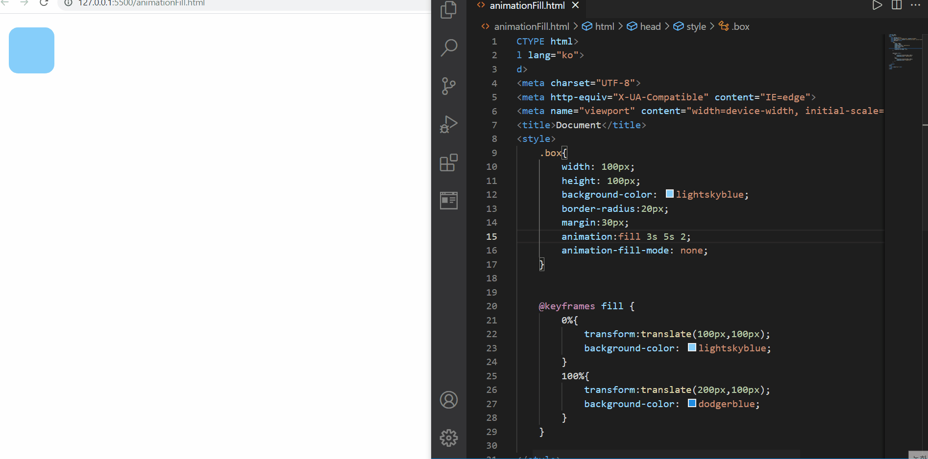
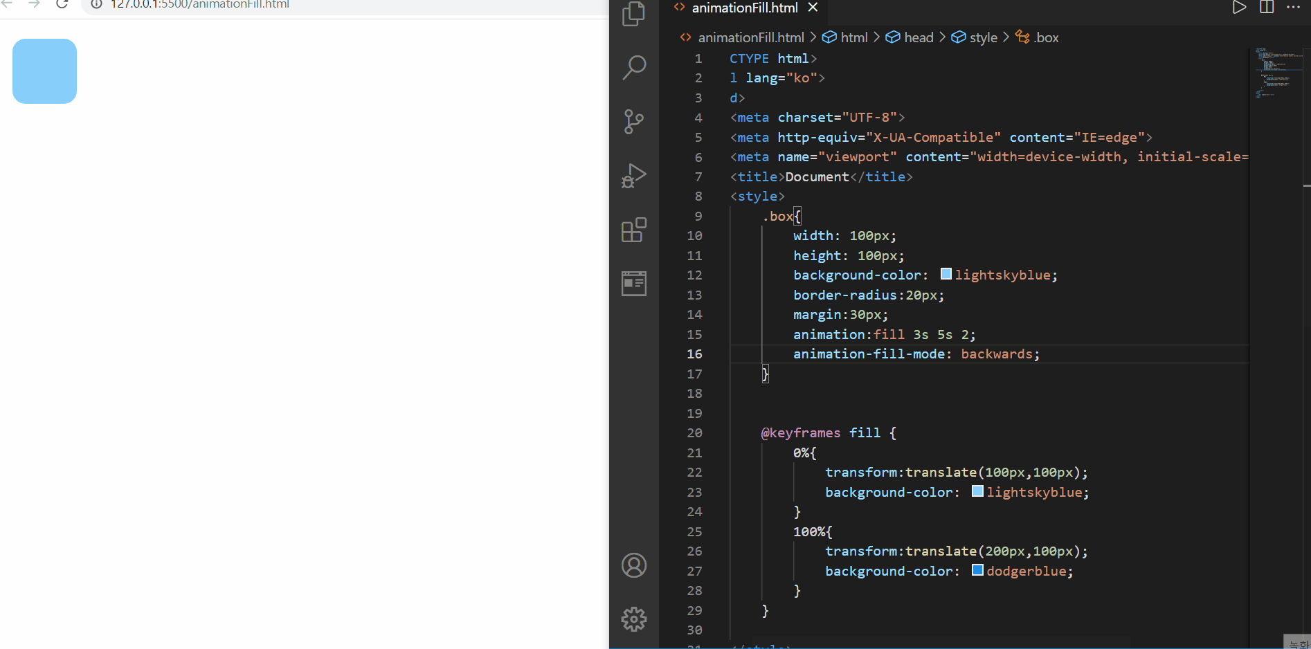
animation-fill-mode overview
처음에 animation-fill-mode의 값을 지정하지 않았을 때에는 정방향 진행 후 원위치에 돌아오는 것을 확인할 수 있다
하지만 animation-fill-mode값을 both로 지정했을 때에는 정방향 진행 후 원위치에 돌아오지 않는 것을 확인할 수 있다
이처럼, 애니메이션 실행 전후 상태를 지정하는 것이 바로 animation-fill-mode이다!
<!DOCTYPE html>
<html lang="ko">
<head>
    <meta charset="UTF-8">
    <meta http-equiv="X-UA-Compatible" content="IE=edge">
    <meta name="viewport" content="width=device-width, initial-scale=1.0">
    <title>Document</title>
    <style>
        .box{
            width: 100px;
            height: 100px;
            background-color: lightskyblue;
            border-radius:20px;
            margin:30px;
            animation:fill 3s 5s 2;
            animation-fill-mode: none;
        }

        @keyframes fill {
            0%{
                transform:translate(100px,100px);
                background-color: lightskyblue;
            }
            100%{
                transform:translate(200px,100px);
                background-color: dodgerblue;
            }
        }

    </style>
</head>
<body>
    <div class="box"></div>
</body>
</html>
<!DOCTYPE html>
<html lang="ko">
<head>
    <meta charset="UTF-8">
    <meta http-equiv="X-UA-Compatible" content="IE=edge">
    <meta name="viewport" content="width=device-width, initial-scale=1.0">
    <title>Document</title>
    <style>
        .box{
            width: 100px;
            height: 100px;
            background-color: lightskyblue;
            border-radius:20px;
            margin:30px;
            animation:fill 3s 5s 2;
            animation-fill-mode: forwards;
        }

        @keyframes fill {
            0%{
                transform:translate(100px,100px);
                background-color: lightskyblue;
            }
            100%{
                transform:translate(200px,100px);
                background-color: dodgerblue;
            }
        }

    </style>
</head>
<body>
    <div class="box"></div>
</body>
</html>
<!DOCTYPE html>
<html lang="ko">
<head>
    <meta charset="UTF-8">
    <meta http-equiv="X-UA-Compatible" content="IE=edge">
    <meta name="viewport" content="width=device-width, initial-scale=1.0">
    <title>Document</title>
    <style>
        .box{
            width: 100px;
            height: 100px;
            background-color: lightskyblue;
            border-radius:20px;
            margin:30px;
            animation:fill 3s 5s 2;
            animation-fill-mode: backwards;
        }

        @keyframes fill {
            0%{
                transform:translate(100px,100px);
                background-color: lightskyblue;
            }
            100%{
                transform:translate(200px,100px);
                background-color: dodgerblue;
            }
        }

    </style>
</head>
<body>
    <div class="box"></div>
</body>
</html>
- 실행해본 순서대로 기재된 것이지만 both는 위에서 기재한바 있어서, 생략하였다
핵심은 delay를 주어서 어디서부터 시작하는지를 명확하게 한 것인데, 그렇지 않으면 애니메이션 시작 지점과 혼동이 올 수 있다
먼저 none을 살펴보자
animation-fill-mode:none
먼저 none은 기존에 우리가 확인했던 것처럼 애니메이션은 기존 요소의 위치에서 시작하고 끝나게 됨을 확인해볼 수 있다
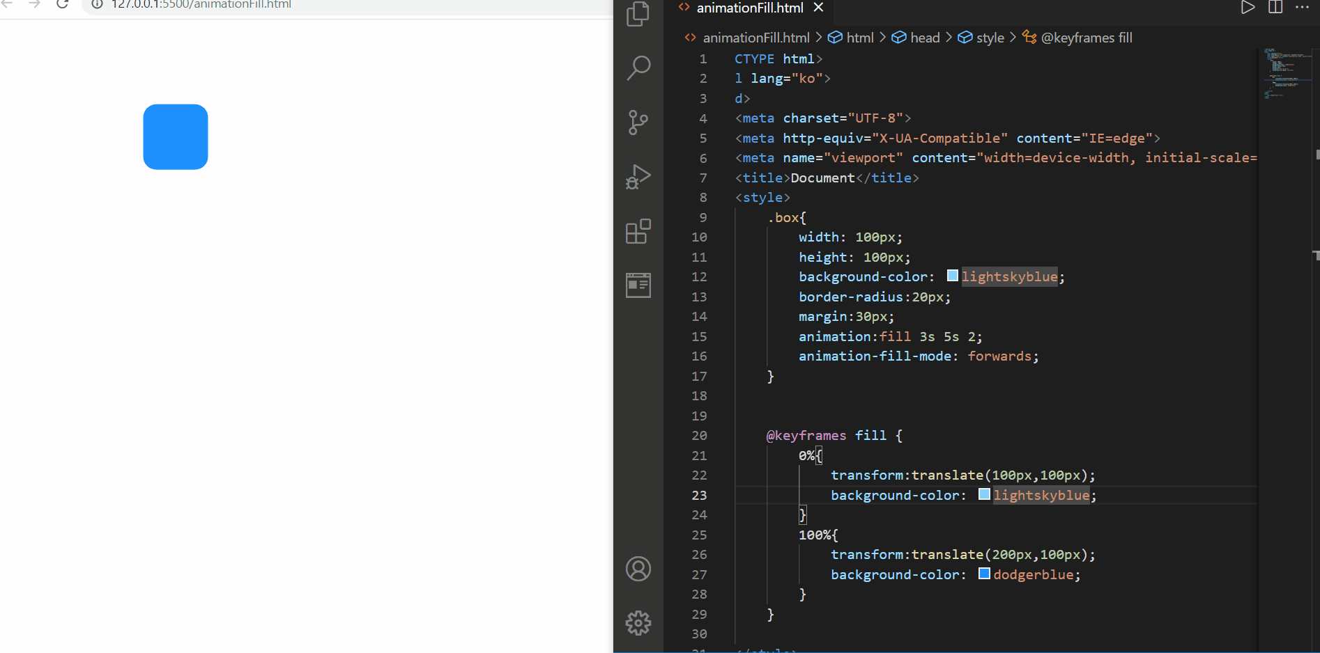
animation-fill-mode:forwards
그리고 forwards는 기존 요소의 위치에서 시작해서 애니메이션 시작 위치로 이동해서 애니메이션 실행을 하고, 애니메이션이 끝나는 위치에서 마무리하게 됨을 확인해볼 수 있다. 위의 이미지를 보면, 마무리는 200px,100px 지점에서 dodgerblue인 요소로 변한 마지막 상태에서 끝나는 것을 확인해볼 수 있다
animation-fill-mode:backwards
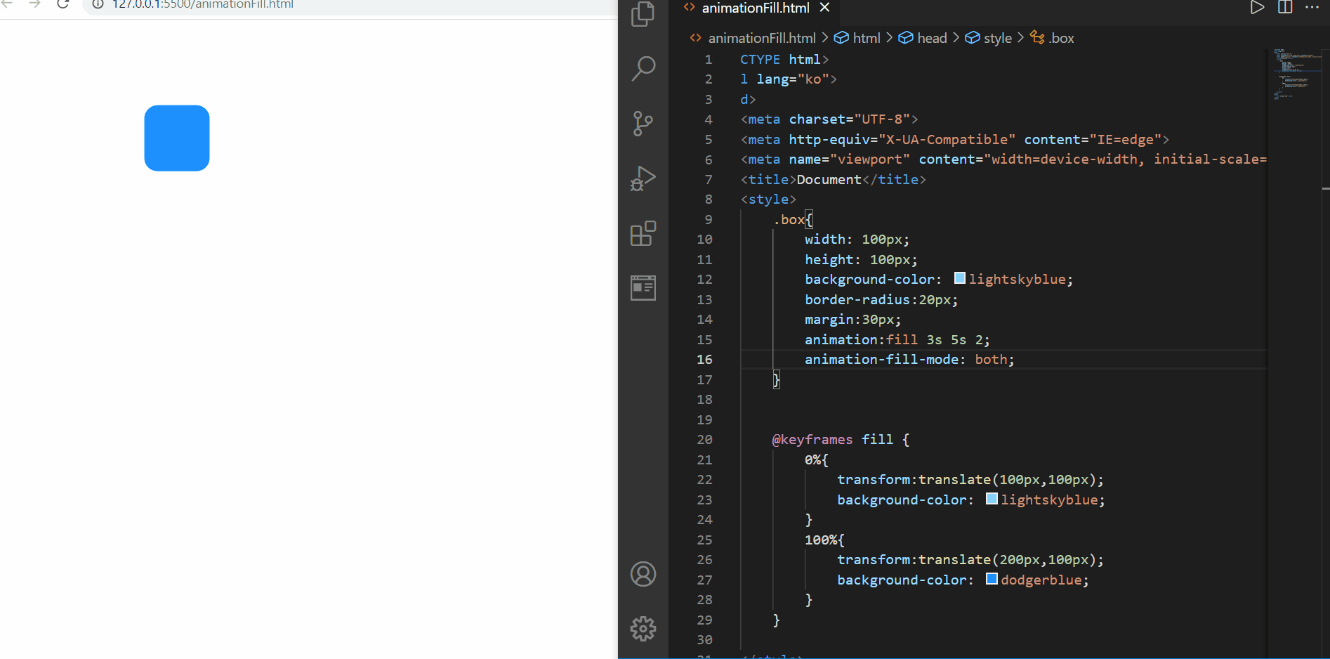
backwards는 html과 css 파일이 로딩되면, 원래 요소가 있는 위치가 아닌, 애니메이션 시작 위치에서 시작하고, 애니메이션 후, 원래 요소 위치로 돌아가는 것을 확인해볼 수 있었다. forwards와는 상반되는 방향인 것 같다
animation-fill-mode:both
both는 forwards와 backwards를 섞은 것 같은데, 교집합 개념은 아닌것 같다! both는 애니메이션 시작 위치에서 시작해서 애니메이션 후에 애니메이션이 끝나는 지점에서 마무리되는 것을 확인해볼 수 있다
- animation-play-state
- 애니메이션의 재생과 정지를 설정
<!DOCTYPE html>
<html lang="ko">
<head>
    <meta charset="UTF-8">
    <meta http-equiv="X-UA-Compatible" content="IE=edge">
    <meta name="viewport" content="width=device-width, initial-scale=1.0">
    <title>Document</title>
    <style>
        body{
            padding:20px;
        }
        .box{
            width: 150px;
            height: 100px;
            background-color: dodgerblue;
            border-radius:20px;
            animation:size-up 3s infinite linear alternate;
        }
        .box:hover{
            animation-play-state: paused;
        }

        @keyframes size-up {
            from{
                width: 150px;
            }
            to{
                width: 100%;
            }
        }
    </style>
</head>
<body>
    <div class="box"></div>
</body>
</html>
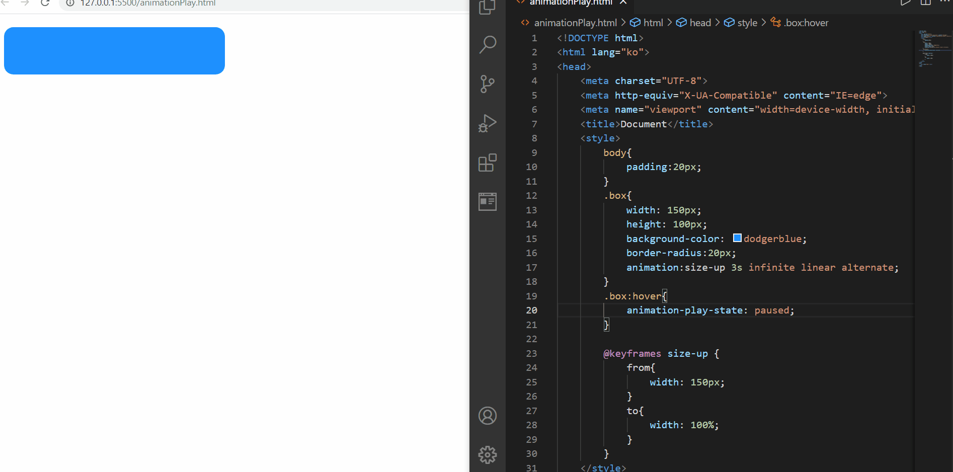
animation-play-paused
위와 같이 animation-play-paused의 값을 paused로 지정해둔다면, 특히 이를 hover와 같은 가상 클래스 선택자와 함께 어떤 행동이 일어났을 때로 국한시킨다면 애니메이션을 일시정지하는 효과를 볼 수 있다
<!DOCTYPE html>
<html lang="ko">
<head>
    <meta charset="UTF-8">
    <meta http-equiv="X-UA-Compatible" content="IE=edge">
    <meta name="viewport" content="width=device-width, initial-scale=1.0">
    <title>Document</title>
    <style>
        body{
            padding:20px;
        }
        .box{
            width: 150px;
            height: 100px;
            background-color: dodgerblue;
            border-radius:20px;
            display:flex;
            justify-content: center;
            align-items: center;
            font-size:30px;
            font-weight:bold;/*==700px*/
            color:white;
            animation:size-up 3s infinite linear alternate;
        }
        .box::before{
            content:"Running";
        }

        .box:hover{
            animation-play-state: paused;
            background-color: forestgreen;
        }

        .box:hover::before{
            content:"Paused";
        }
        @keyframes size-up {
            from{
                width: 150px;
            }
            to{
                width: 100%;
            }
        }
    </style>
</head>
<body>
    <div class="box"></div>
    <!-- <script>
        let ele = document.querySelector(".box");

        function changeState(){
            ele.innerHTML="Paused";
        }

        ele.addEventListener("mouseover",changeState);
    </script> -->
</body>
</html>
<!DOCTYPE html>
<html lang="ko">
<head>
    <meta charset="UTF-8">
    <meta http-equiv="X-UA-Compatible" content="IE=edge">
    <meta name="viewport" content="width=device-width, initial-scale=1.0">
    <title>Document</title>
    <style>
        body{
            padding:20px;
        }
        .box{
            width: 150px;
            height: 100px;
            background-color: dodgerblue;
            border-radius:20px;
            display:flex;
            justify-content: center;
            align-items: center;
            font-size:30px;
            font-weight:bold;/*==700px*/
            color:white;
            animation:size-up 3s infinite linear alternate;
        }
        .box::after{
            content:"Running";
        }

        .box:hover{
            animation-play-state: paused;
            background-color: forestgreen;
        }

        .box:hover::after{
            content:"Paused";
        }
        @keyframes size-up {
            from{
                width: 150px;
            }
            to{
                width: 100%;
            }
        }
    </style>
</head>
<body>
    <div class="box"></div>
    <!-- <script>
        let ele = document.querySelector(".box");

        function changeState(){
            ele.innerHTML="Paused";
        }

        ele.addEventListener("mouseover",changeState);
    </script> -->
</body>
</html>
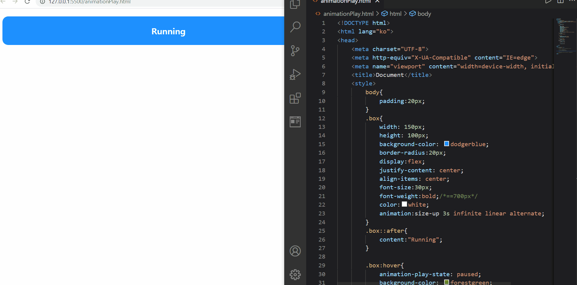
animation-play-paused
이번에는 가상 클래스 선택자 before 혹은 after를 이용해서 (before로 통일 혹은 after로 통일하여 두 단어가 모두 표시되지 않고 둘 중 하나만 띄워지도록 해야 한다!) 각 상태를 확인해볼 수 있었다
마우스를 올리면 색상이 바뀌고 애니메이션이 멈추는 것을 확인해볼 수 있었다
(마우스를 떼면 다음 동작이 진행된다)
- 다단 만들기 Multi-Columns
- 일반 블록 레이아웃을 확장하여 여러 텍스트 다단으로 쉽게 정리하며, 가독성 확보
- 신문 기사 등의 레이아웃에 적절
1) columns
- 다단을 정의
- 단축, 개별 속성 지원
[USAGE]
columns: 너비 갯수;
.text{ columns:100px 2; }
🌺 column-width 속성값
- 단의 최적 너비를 설정
[USAGE]
column-width: 너비;
🌟 각 단이 줄어들 수 있는 최적 너비(최소 너비)를 설정하고, 요소의 너비가 가변하여 하나의 단의 너비 < 최소 너비가 되는 경우에는 단의 갯수가 조정된다!
🌺 column-count 속성값
- 단의 개수를 설정
<!DOCTYPE html>
<html lang="ko">

<head>
    <meta charset="UTF-8">
    <meta http-equiv="X-UA-Compatible" content="IE=edge">
    <meta name="viewport" content="width=device-width, initial-scale=1.0">
    <title>Document</title>
    <style>
        p{
            column-width:300px;
            column-count:3;
            font-size:30px;
        }
    </style>
</head>
<body>
    <p>Bacon ipsum dolor amet hamburger spare ribs turducken short ribs. Leberkas strip steak doner chuck turducken
        salami chicken ground round alcatra tongue. Chicken picanha tenderloin chislic jerky short loin biltong
        landjaeger burgdoggen. Swine rump turducken, drumstick corned beef shankle pork chop pork doner sirloin strip
        steak short loin. Short ribs short loin prosciutto ham beef ribs kevin.

        Ham ball tip kevin pig turducken. Frankfurter hamburger jerky t-bone kielbasa alcatra burgdoggen ground round
        biltong short ribs flank tongue prosciutto pork chop. Beef pork jowl, boudin jerky tri-tip andouille sirloin
        pork belly chuck. Pig turducken pancetta chuck turkey hamburger jerky tri-tip spare ribs short loin ham hock
        meatloaf bresaola swine. Capicola turkey prosciutto andouille shank tenderloin sirloin beef ribs pork belly
        short loin burgdoggen boudin. Leberkas pork belly rump ball tip ground round tail chicken jerky shankle
        porchetta capicola fatback filet mignon beef ribs venison. Ham sirloin doner, shoulder beef swine chicken turkey
        spare ribs shankle.

        Leberkas andouille ham kevin pork. Kevin beef filet mignon sirloin. Jowl bacon leberkas doner t-bone fatback
        meatloaf. Ham hock meatball rump drumstick fatback shoulder kevin pork loin leberkas alcatra swine short ribs.
        Corned beef beef ribs biltong shankle, chuck boudin turducken capicola andouille porchetta ground round. Spare
        ribs frankfurter chuck fatback prosciutto turducken kevin leberkas.

        Ham short ribs spare ribs landjaeger t-bone shankle bresaola biltong andouille. Fatback ball tip buffalo, pork
        picanha frankfurter sausage pastrami swine pork loin kielbasa doner short ribs bacon turducken. Shank meatloaf
        ground round, ball tip filet mignon alcatra spare ribs venison turducken kevin sausage. Turducken shankle
        pancetta short ribs, burgdoggen swine tail strip steak alcatra venison pig ham.

        Ham hock meatball bacon tenderloin pork chop, leberkas beef pork tri-tip porchetta jowl ground round landjaeger
        cow sirloin. Landjaeger shoulder turkey meatball spare ribs andouille fatback chuck tenderloin chicken short
        ribs brisket rump turducken strip steak. Meatball turkey corned beef pork loin, strip steak turducken pastrami
        frankfurter ribeye rump. Bresaola venison biltong alcatra, turkey landjaeger pork chop porchetta. Pork chop
        sausage salami doner, drumstick kielbasa brisket porchetta frankfurter turducken cow strip steak picanha. Turkey
        beef ribs bresaola shankle, landjaeger jowl hamburger cow pork spare ribs short loin sausage shank chislic. Ham
        drumstick beef ribs, spare ribs meatball short ribs landjaeger bresaola venison burgdoggen pastrami.

        Does your lorem ipsum text long for something a little meatier? Give our generator a try… it’s tasty!</p>
</body>
</html>

columns 속성
궁금했던 부분은
1️⃣ column-width만 작성했을 때 화면 크기에 따른 화면 구성 변화는 어떨까?
2️⃣ column-width와 column-count를 모두 지정했을 때 화면 구성 변화는 어떨까?
가 확인하고 싶어서 위의 이미지처럼 확인하게 되었다
먼저 column-width만을 지정했을 경우에는
화면 크게이 따라 단의 갯수가 줄어들긴 하지만, 극한으로 줄어들면 더이상 최적 너비가 지켜지지 않음을 확인해볼 수 있었다(예상했던 것은 화면이 줄어들다가 300px에 걸려서 개발자 도구가 더이상 줄어들지 않는..?그런 생각이었는데 예외라서 조금 뜻밖이었다)
그리고 두번째로, column-width와 함께 column-count를 모두 지정했을 때에는 단의 갯수가 300px너비까지는 3개로 지켜지지만 이 역시도 300px보다 줄어들고, 극한으로 가게 되면 무력화되는 것같다(물론 너비도)
[물론 극한의 상황은 없겠지만..?]
2) column-gap
- 단과 단 사이의 간격 설정
[USAGE]
column-gap: 간격;
3) column-rule
- 단과 단 사이의 (구분)선을 지정
- 단축, 개별 속성 지정
▶️ border 처럼 사용 가능
[USAGE]
column-rule: 두께 종류 색상;
🌟구분선은 단과 단 사이의 간격 중간에 위치한다!
<!DOCTYPE html>
<html lang="ko">

<head>
    <meta charset="UTF-8">
    <meta http-equiv="X-UA-Compatible" content="IE=edge">
    <meta name="viewport" content="width=device-width, initial-scale=1.0">
    <title>Document</title>
    <style>
        *{
            padding:0;
            margin:0;
        }
        p{
            text-align:justify;/*양쪽정렬*/
            font-size:30px;
            columns:150px 3;
            column-gap:2em;
            column-rule:3px dashed dodgerblue;
        }
    </style>
</head>
<body>
    <p>Bacon ipsum dolor amet hamburger spare ribs turducken short ribs. Leberkas strip steak doner chuck turducken
        salami chicken ground round alcatra tongue. Chicken picanha tenderloin chislic jerky short loin biltong
        landjaeger burgdoggen. Swine rump turducken, drumstick corned beef shankle pork chop pork doner sirloin strip
        steak short loin. Short ribs short loin prosciutto ham beef ribs kevin.

        Ham ball tip kevin pig turducken. Frankfurter hamburger jerky t-bone kielbasa alcatra burgdoggen ground round
        biltong short ribs flank tongue prosciutto pork chop. Beef pork jowl, boudin jerky tri-tip andouille sirloin
        pork belly chuck. Pig turducken pancetta chuck turkey hamburger jerky tri-tip spare ribs short loin ham hock
        meatloaf bresaola swine. Capicola turkey prosciutto andouille shank tenderloin sirloin beef ribs pork belly
        short loin burgdoggen boudin. Leberkas pork belly rump ball tip ground round tail chicken jerky shankle
        porchetta capicola fatback filet mignon beef ribs venison. Ham sirloin doner, shoulder beef swine chicken turkey
        spare ribs shankle.

        Leberkas andouille ham kevin pork. Kevin beef filet mignon sirloin. Jowl bacon leberkas doner t-bone fatback
        meatloaf. Ham hock meatball rump drumstick fatback shoulder kevin pork loin leberkas alcatra swine short ribs.
        Corned beef beef ribs biltong shankle, chuck boudin turducken capicola andouille porchetta ground round. Spare
        ribs frankfurter chuck fatback prosciutto turducken kevin leberkas.

        Ham short ribs spare ribs landjaeger t-bone shankle bresaola biltong andouille. Fatback ball tip buffalo, pork
        picanha frankfurter sausage pastrami swine pork loin kielbasa doner short ribs bacon turducken. Shank meatloaf
        ground round, ball tip filet mignon alcatra spare ribs venison turducken kevin sausage. Turducken shankle
        pancetta short ribs, burgdoggen swine tail strip steak alcatra venison pig ham.

        Ham hock meatball bacon tenderloin pork chop, leberkas beef pork tri-tip porchetta jowl ground round landjaeger
        cow sirloin. Landjaeger shoulder turkey meatball spare ribs andouille fatback chuck tenderloin chicken short
        ribs brisket rump turducken strip steak. Meatball turkey corned beef pork loin, strip steak turducken pastrami
        frankfurter ribeye rump. Bresaola venison biltong alcatra, turkey landjaeger pork chop porchetta. Pork chop
        sausage salami doner, drumstick kielbasa brisket porchetta frankfurter turducken cow strip steak picanha. Turkey
        beef ribs bresaola shankle, landjaeger jowl hamburger cow pork spare ribs short loin sausage shank chislic. Ham
        drumstick beef ribs, spare ribs meatball short ribs landjaeger bresaola venison burgdoggen pastrami.

        Does your lorem ipsum text long for something a little meatier? Give our generator a try… it’s tasty!</p>
</body>
</html>
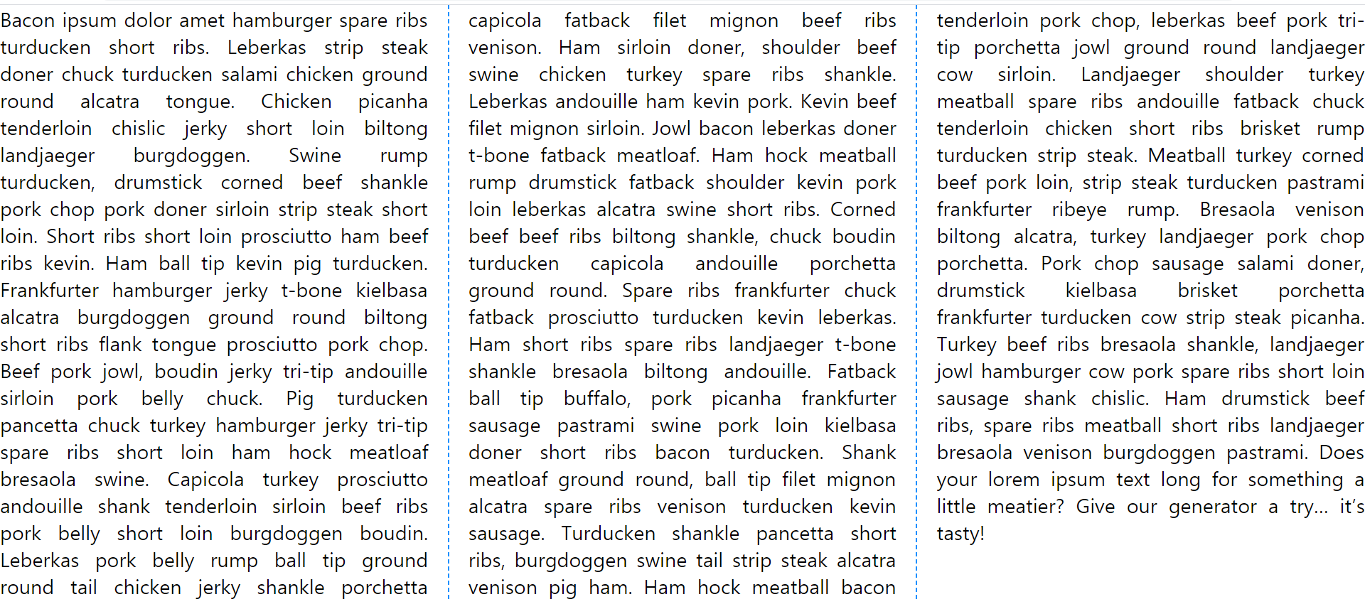
column-rule
먼저 보기 좋게 양쪽 정렬을 해주기 위해서 text-align:justify를 해주고, column-gap은 기본값은 1em이지만 2em(=60px)로 지정해주었고, 단 사이 간격은 60px이 되었다
| 그리고 그 사이(단 | —-30px—- | 선 | —-30px—- | 단)에는 3px 두께의 파선이 dodgerblue 색상으로 들어가게 되었다(만약 색상을 지정하지 않았다면, 글자색과 동일한 검정색으로 보여졌을 것이다 그런데 색상을 명시했으므로 해당 색으로 선이 지정되었다) |
🌟 선의 종류는 dotted등도 있으나 보통 solid, dashed를 많이 사용한다