1_[css]위치를 나타내는 position
CSS-position 위치 속성
❓ position ❓
- 요소의 위치 지정 방법의 유형(기준)을 설정
기준을 설정한 후, 기준으로부터 어느정도 거리에 요소를 배치할 지 정하는 top, bottom, left, right(각각 기준으로부터 위,아래, 왼쪽, 오른쪽 방향으로 일정 거리를 두고 요소를 배치하는 것을 의미) 단!! position으로 기준이 잡혀있을 때에만 해당 속성을 사용할 수 있다!!
먼저 static을 보자!
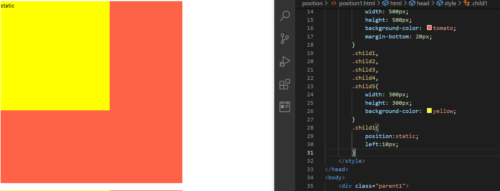
position:static
앞서 언급한 바와 같이, position : static은 어떠한 기준을 잡지 않기 때문에, 배치를 할 수가 없다! 위쪽의 그림은 그의 특징을 제대로 보여주고 있다
그 다음에는 position:relative 를 살펴보자
<!DOCTYPE html>
<html lang="ko">
<head>
    <meta charset="UTF-8">
    <meta http-equiv="X-UA-Compatible" content="IE=edge">
    <meta name="viewport" content="width=device-width, initial-scale=1.0">
    <title>Document</title>
    <style>
        .box{
            width: 100px;
            height: 100px;
            background-color: yellow;
            border:3px solid red;
            border-radius: 10px;
            display:flex;
            justify-content: center;
            align-items: center;
            font-size:30px;
        }
        .relative{
            position:relative;
            left:30px;
            top:30px;
        }
    </style>
</head>
<body>
    <div class="box">1</div>
    <div class="box relative">2</div>
    <div class="box">3</div>
</body>
</html>

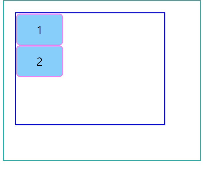
position:relative
relative는 자기자신을 기준으로 한다는 것이 약간 애매할 수도 있는데, 이는 “기존의 본인이 있었던 위치로부터” 어느 방향으로 일정 거리 떨어진 위치에 배치함을 의미한다. 즉, 만약
<div class="parent">
	<div class="child">
	</div>
</div>
위와 같은 관계에서는 아래처럼 parent 요소의 기준을 잡은 후 child 요소의 기준을 잡은 경우와
.parent{
	position:relative;
}
.child{
	position:absolute;
	left:10px;
}
아래처럼 child 요소에 대해서 relative를 지정한 경우가 결과적으로 매우 흡사해보인다
.child{
	position:relative;
	left:10px;
}
하지만, 앞서 말했듯이, relative는 “원래 자기 자신이 있었던 위치를 기준으로” 한다는 의미론적인 개념을 명심해야 한다!
다만, 참고할 사항이 있다면, 위의 그림에서 1번 요소가 빠지면 2번 요소는 앞당겨지기 때문에, “relative는 형제 요소의 영향을 받는다는 것”을 주의할 필요가 있다
그렇기 때문에, 배치라는 개념을 사용하고자 한다면 absolute나 fixed를 사용하는 것이 보다 권장된다!
그 다음은 position:absolute를 살펴보자
<!DOCTYPE html>
<html lang="ko">
<head>
    <meta charset="UTF-8">
    <meta http-equiv="X-UA-Compatible" content="IE=edge">
    <meta name="viewport" content="width=device-width, initial-scale=1.0">
    <title>Document</title>
    <style>
        .grand-parent{
            width: 400px;
            height: 300px;
            padding: 30px 100px 100px 30px;
            border:3px solid lightseagreen;
        }
        .parent{
            width: 400px;
            height: 300px;
            border:3px solid blue;
        }
        .child{
            width: 120px;
            height: 80px;
            background-color: lightskyblue;
            border:3px solid violet;
            border-radius: 10px;
            font-size: 30px;
            display:flex;
            justify-content: center;
            align-items: center;
        }
        .absolute{
            position:absolute;
        }
    </style>
</head>
<body>
    <div class="grand-parent">
        <div class="parent">
            <div class="child">1</div>
            <div class="child absolute">2</div>
            <div class="child">3</div>
        </div>
    </div>
</body>
</html>
position:absolute
먼저 위의 그림의 경우, 2번 요소에 대해서 “position:absolute”를 지정함으로써, 1번과 3번 요소와는 별개로, 파란색 요소(위치상 부모요소)를 기준으로 위치가 지정되는데, 지금은 top이나 다른 속성을 지정하지 않았기 때문에 3번 요소는 2번 요소 뒤쪽에 위치하는 것처럼 보여진다!
🌟 위치상 부모 요소는 position:~ 로 기준이 설정되어 있어야 됨!(static 제외!!)
- sticky, relative, absolute는 기준이 변경될 수 있기 때문에 부모요소가 존재하지 않을 수도 있는데, 이 경우, position:relative를 이용해서 위치상 부모 요소를 설정해주자!
<!DOCTYPE html>
<html lang="ko">
<head>
    <meta charset="UTF-8">
    <meta http-equiv="X-UA-Compatible" content="IE=edge">
    <meta name="viewport" content="width=device-width, initial-scale=1.0">
    <title>Document</title>
    <style>
        .grand-parent{
            width: 400px;
            height: 300px;
            padding: 30px 100px 100px 30px;
            border:3px solid lightseagreen;
        }
        .parent{
            width: 400px;
            height: 300px;
            border:3px solid blue;
        }
        .child{
            width: 120px;
            height: 80px;
            background-color: lightskyblue;
            border:3px solid violet;
            border-radius: 10px;
            font-size: 30px;
            display:flex;
            justify-content: center;
            align-items: center;
        }
        .absolute{
            position:absolute;
            left:100px;
            top:50px;
        }
    </style>
</head>
<body>
    <div class="grand-parent">
        <div class="parent">
            <div class="child">1</div>
            <div class="child absolute">2</div>
            <div class="child">3</div>
        </div>
    </div>
</body>
</html>
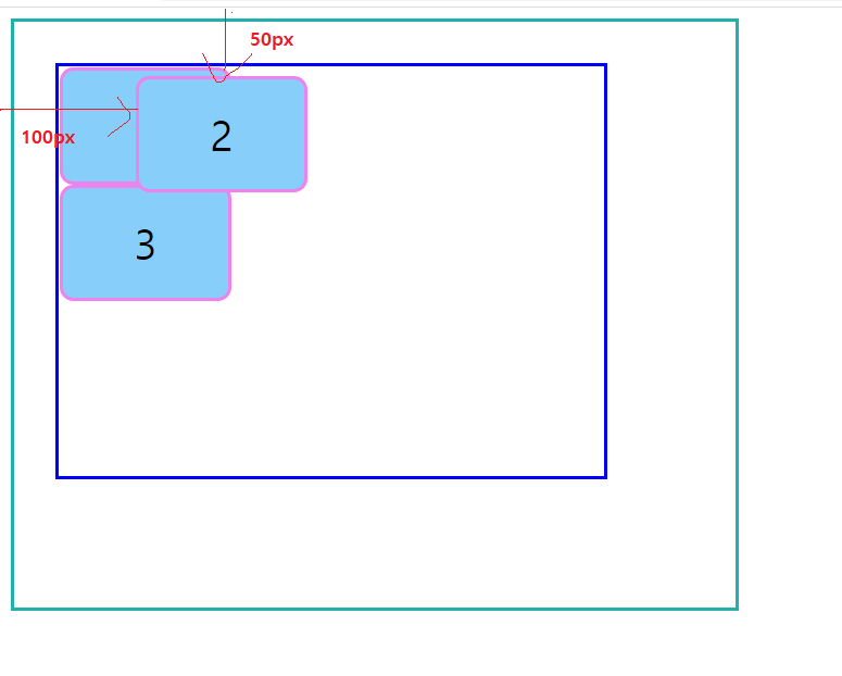
position:absolute
위의 경우, 부모요소의 기준을 설정해주지 않았기 때문에, 뷰포트가 “위치상 부모요소”가 되어 적용된다!(위치상 부모요소는 절대! html 구조상 부모요소와 다르다!)
그러면, 이번에는 일단은 의미상 부모요소 자신을 기준으로 잡기만 하면 되므로, parent 요소에 position:relative를 지정해보자
<!DOCTYPE html>
<html lang="ko">
<head>
    <meta charset="UTF-8">
    <meta http-equiv="X-UA-Compatible" content="IE=edge">
    <meta name="viewport" content="width=device-width, initial-scale=1.0">
    <title>Document</title>
    <style>
        .grand-parent{
            width: 400px;
            height: 300px;
            padding: 30px 100px 100px 30px;
            border:3px solid lightseagreen;
        }
        .parent{
            width: 400px;
            height: 300px;
            border:3px solid blue;
            position:relative;
        }
        .child{
            width: 120px;
            height: 80px;
            background-color: lightskyblue;
            border:3px solid violet;
            border-radius: 10px;
            font-size: 30px;
            display:flex;
            justify-content: center;
            align-items: center;
        }
        .absolute{
            position:absolute;
            left:100px;
            top:50px;
        }
    </style>
</head>
<body>
    <div class="grand-parent">
        <div class="parent">
            <div class="child">1</div>
            <div class="child absolute">2</div>
            <div class="child">3</div>
        </div>
    </div>
</body>
</html>

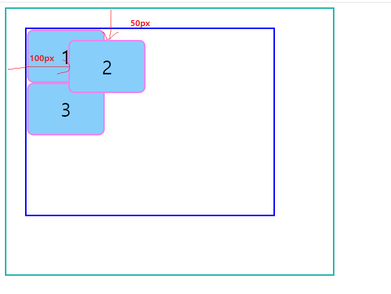
position:absolute - 가장 가까운 부모요소가 기준이 되고, 이를 기준으로 위치를 잡은 경우
위와 같이 parent 요소를 position:relative;로 설정해주면, parent 요소가 정말 위치상 부모요소가 되어, 이를 기준으로 위치를 지정하게 된다
<!DOCTYPE html>
<html lang="ko">
<head>
    <meta charset="UTF-8">
    <meta http-equiv="X-UA-Compatible" content="IE=edge">
    <meta name="viewport" content="width=device-width, initial-scale=1.0">
    <title>Document</title>
    <style>
        .grand-parent{
            width: 400px;
            height: 300px;
            padding: 30px 100px 100px 30px;
            border:3px solid lightseagreen;
            position:relative;
        }
        .parent{
            width: 400px;
            height: 300px;
            border:3px solid blue;

        }
        .child{
            width: 120px;
            height: 80px;
            background-color: lightskyblue;
            border:3px solid violet;
            border-radius: 10px;
            font-size: 30px;
            display:flex;
            justify-content: center;
            align-items: center;
        }
        .absolute{
            position:absolute;
            left:100px;
            top:50px;
        }
    </style>
</head>
<body>
    <div class="grand-parent">
        <div class="parent">
            <div class="child">1</div>
            <div class="child absolute">2</div>
            <div class="child">3</div>
        </div>
    </div>
</body>
</html>
position:absolute - 조상요소가 기준이 되고, 이를 기준으로 위치를 잡은 경우
위와 같이, 조상요소를 position:relative로 설정해주면, 조상요소가 위치상 부모요소가 되고, absolute요소는 position:absolute로 인해서 조상요소를 기준으로 위치를 지정할 수 있게 된다
[조상요소로 position이 전파될 수 있음을 확인해볼 수도 있다!]
그 다음으로는 position:fixed를 확인해보자
앞서, absolute에서 position:~~가 지정된 요소가 없어서, 위치상 부모요소가 존재하지 않는 경우, 결국에는 뷰포트가 그 역할을 담당하게 되어, 뷰포트를 기준으로 위치가 지정된다고 설명하였었다
물론, 뷰포트를 위치상 부모요소로 삼을 때 이런 식으로 하여도 되지만, 보통은 명시적으로
position:fixed
를 적어주는 것이 보다 권장된다!
<!DOCTYPE html>
<html lang="ko">

<head>
    <meta charset="UTF-8">
    <meta http-equiv="X-UA-Compatible" content="IE=edge">
    <meta name="viewport" content="width=device-width, initial-scale=1.0">
    <title>Document</title>
    <style>
        .grand-parent {
            width: 400px;
            height: 300px;
            padding: 30px 100px 100px 30px;
            border: 3px solid lightseagreen;
        }

        .parent {
            width: 400px;
            height: 300px;
            border: 3px solid blue;

        }

        .child {
            width: 120px;
            height: 80px;
            background-color: lightskyblue;
            border: 3px solid violet;
            border-radius: 10px;
            font-size: 30px;
            display: flex;
            justify-content: center;
            align-items: center;
        }

        .fixed{
            position: fixed;
            bottom: 50px;
            right: 10px;
        }
    </style>
</head>
<body>
    <div class="grand-parent">
        <div class="parent">
            <div class="child">1</div>
            <div class="child fixed">2</div>
            <div class="child">3</div>
        </div>
    </div>
</body>

</html>

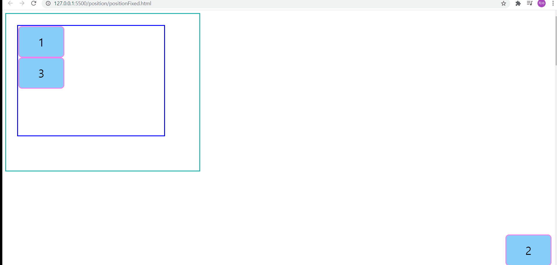
position:fixed
위의 경우, position:fixed로 인해서, 뷰포트를 기준으로 오른쪽에서 10px, 아래쪽에서 50px 떨어진 위치에 요소2가 배치된다
또한, body 크기를 지정해두고, 특정 요소에 position:fixed를 지정해둔다면, 아래와 같이, 일정 위치에 떠있는 것처럼 보이게 된다
<!DOCTYPE html>
<html lang="ko">

<head>
    <meta charset="UTF-8">
    <meta http-equiv="X-UA-Compatible" content="IE=edge">
    <meta name="viewport" content="width=device-width, initial-scale=1.0">
    <title>Document</title>
    <style>
        body{
            height: 4000px;
        }
        .grand-parent {
            width: 400px;
            height: 300px;
            padding: 30px 100px 100px 30px;
            border: 3px solid lightseagreen;
        }

        .parent {
            width: 400px;
            height: 300px;
            border: 3px solid blue;

        }

        .child {
            width: 120px;
            height: 80px;
            background-color: lightskyblue;
            border: 3px solid violet;
            border-radius: 10px;
            font-size: 30px;
            display: flex;
            justify-content: center;
            align-items: center;
        }

        .fixed{
            position: fixed;
            bottom: 50px;
            right: 10px;
        }
    </style>
</head>
<body>
    <div class="grand-parent">
        <div class="parent">
            <div class="child">1</div>
            <div class="child fixed">2</div>
            <div class="child">3</div>
        </div>
    </div>
</body>

</html>
position:fixed - body 요소의 높이가 지정되어 있는 경우
이번에는 position:sticky를 살펴보자
position:sticky는 스크롤 영역을 기준으로 배치한다는 특징을 갖고 있다!
단, position:sticky는 해당 속성이 지정된 요소의 부모 요소 밖으로는 컨텐츠 등이 나가지 못한다!
*현재 인터넷 익스플로러 지원이 끊어진 상황이지만, IE는 기존에 이 속성-속성값을 지원하지 않았다고 한다
<!DOCTYPE html>
<html lang="ko">
<head>
    <meta charset="UTF-8">
    <meta http-equiv="X-UA-Compatible" content="IE=edge">
    <meta name="viewport" content="width=device-width, initial-scale=1.0">
    <title>Document</title>
    <style>
        *{
            padding:0;
            margin:0;
        }
        .section{
            height: 200px;
            border:4px dashed lightskyblue;
        }
        .section h1{
            text-align: center;
            line-height:2;/*48px*/
            font-size:24px;
            font-weight:bold;
            position:sticky;
            top:100px;
        }
    </style>
</head>
<body>
    <div class="section">
        <h1>title1</h1>
    </div>
    <div class="section">
        <h1>title2</h1>
    </div>
    <div class="section">
        <h1>title3</h1>
    </div>
    <div class="section">
        <h1>title4</h1>
    </div>
    <div class="section">
        <h1>title5</h1>
    </div>
    <div class="section">
        <h1>title6</h1>
    </div>
    <div class="section">
        <h1>title7</h1>
    </div>
    <div class="section">
        <h1>title8</h1>
    </div>
</body>
</html>
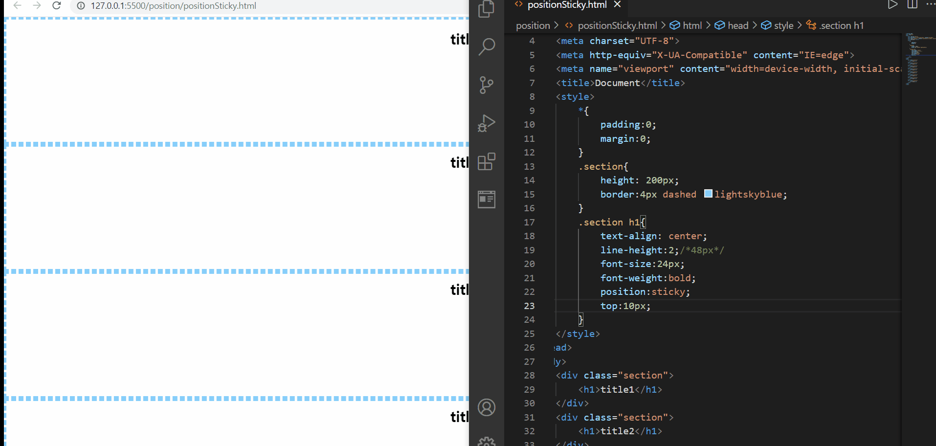
position:sticky
위의 예제에서는 코드상 지금 top값이 100px으로 되어있지만, 처음에 top값을 10px로 테스트해본 후, 100px로 변경하여 테스트해보았다. 사진으로 볼 수 있듯, sticky는 현재 스크롤하는 영역을 기준으로 위치를 선정하게 되기 때문에 처음에는 스크롤하는 영역에서 위에서 10px만큼 떨어진 위치에 요소를 보이고, 그 후 100px 떨어진 위치에 요소를 보여주게 된다
그리고 위에서 설명했듯, sticky가 적용된 부모요소를 컨텐츠 등이 빠져나갈 수 없기 때문에, section이 끝나게 되면, 내부에 있던 컨텐츠 등이 보이지 않게 된다
🌟sticky를 사용하고자 한다면 top, left, right, bottom 중 하나를 꼭 기입해야 그 효과를 확인해볼 수 있다![position:sticky는 자바스크립트로 구현하는 방식(스크롤 이벤트를 감지해서 핸들러 함수를 실행하도록 하는 방향)보다 간단하다!]
지금은, 스크롤하는 영역이 뷰포트라서 다소 fixed와 범위가 비슷하다고 생각이 들 수도 있다. 그래서 특정 영역 내에서 적용해보자
<!DOCTYPE html>
<html lang="ko">
<head>
    <meta charset="UTF-8">
    <meta http-equiv="X-UA-Compatible" content="IE=edge">
    <meta name="viewport" content="width=device-width, initial-scale=1.0">
    <title>Document</title>
    <style>
        *{
            padding:0;
            margin:0;
        }
        .container{
            width: 400px;
            height: 400px;
            border:3px solid orangered;
            overflow:auto;
        }
        .section{
            height: 200px;
            border:4px dashed lightskyblue;
        }
        .section h1{
            text-align: center;
            line-height:2;/*48px*/
            font-size:24px;
            font-weight:bold;
            position:sticky;
            top:0;
        }
    </style>
</head>
<body>
    <div class="container">
        <div class="section">
            <h1>title1</h1>
        </div>
        <div class="section">
            <h1>title2</h1>
        </div>
        <div class="section">
            <h1>title3</h1>
        </div>
        <div class="section">
            <h1>title4</h1>
        </div>
        <div class="section">
            <h1>title5</h1>
        </div>
        <div class="section">
            <h1>title6</h1>
        </div>
        <div class="section">
            <h1>title7</h1>
        </div>
        <div class="section">
            <h1>title8</h1>
        </div>
    </div>
</body>
</html>

position:sticky
먼저, 특정 영역에서 넘쳐나게 되면 overflow 속성을 그 영역에서 지정해주지 않은 한, 스크롤영역에서 벗어나서 스크롤 영역이 뷰포트를 기준으로 하게 된다. 따라서 특정 영역에서의 position:sticky를 확인해보기 위해서 overflow:auto 혹은 overflow:scroll을 설정해주었다
그 결과, 스크롤 영역이 container 요소가 되어, container를 기준으로 스크롤될때 위에서 0만큼 떨어진 위치에 요소 컨텐츠를 보여주는 행동을 반복하여 보여준다
다음에는 화면에 position 속성을 통해서 요소가 쌓이는 순서인 Stack order(요소 쌓임 순서), 일명 z-index에 대해서 공부해보자!
- 요소쌓임순서로 인해서, “Z축”의 개념을 살펴볼 필요가 있다!
- Z축은, 요소가 사용자로부터 얼마나 가까이 있는지를 나타내는 지표로, 가까이 있을 수록 더 위에 쌓여있다는 의미를 가진다
- 당연한 말이지만, position:static은 기준을 정할 수 없어서 배치조차도 할 수 없기 때문에, 이를 제외한 모든 position 속성값에 대해서, 세부 속성인 top bottom left right의 값과는 무관하게, 가장 위에 쌓이게 된다
- position이 모두 존재한다면, z-index 값이 높을 수록 위에 쌓이게 된다
- position 속성 값이 존재하는데, z-index 값이 같은 경우에는 HTML의 마지막 코드가 위에 쌓이게 된다(from top to bottom)
[요소쌓임순서의 중요도/비교 순]position > z-index > html 마지막코드
💐 CSS box-shadow property 💐
🌟 요소는 box-shadow까지 모두 포함되어 있음을 당연하지만 꼭 기억하도록 하자!
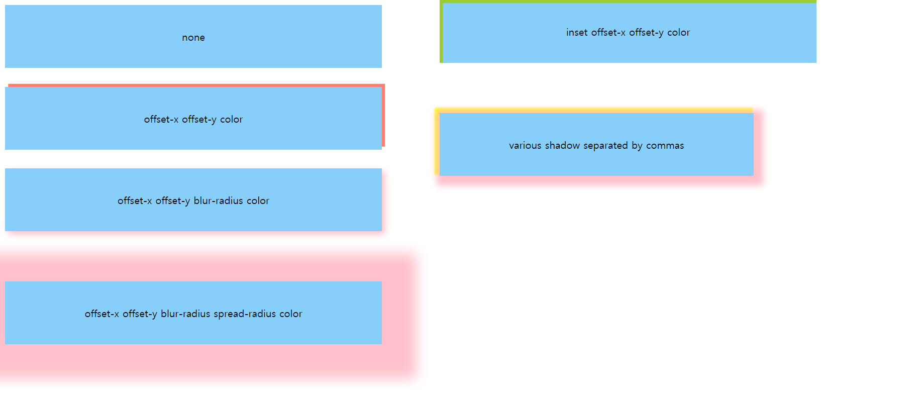
- box-shadow:none; - 상자의 그림자가 없는 상태
- box-shaodw: offset-x offset-y color; - 상자로부터 offset-x, offxset-y만큼 떨어진 위치에 color 색상의 그림자를 생성
-
단, offset-y값이 음수면 상자의 위쪽 방향으로 offset-y 만큼 그림자가 생기고, 양수면 상자의 아래쪽 방향으로 offset-y 만큼 그림자가 생간다 -단, offset-x값이 음수면 상자의 왼쪽방향으로 offset-x 만큼의 그림자가 생기고, 양수면 상자의 오른쪽 방향으로 offset-x 만큼 그림자가 생긴다
-
- box-shadow: offset-x offset-y blur-radius color ; - 다른 것은 2번과 동일하지만, 다른 점은 blur-radius크기만큼 blur 처리된 그림자가 보이게 된다 -blur-radius 크기가 음수일 수록 blur 효과가 점차 미미해진다
- box-shaodw: offset-x offset-y blur-radius spread-radius color; - 4번에 그림자 번짐이 spread-radius 크기만큼 적용되는 것이 추가된 것으로, 이 값이 음수가 될 수록 spread 효과와 더불어 blur도 점차 미미해진다
- box-shadow: inset offset-x offset-y color; - inset은 border-style에서도 확인하였던 속성값처럼, 어떤 딱맞는 상자 내부로 훅 들어간 느낌을 주게 된다. 그래서 offset값이 모두 양수이더라도, 각각이 음수가 된 것 처럼 느껴지는 그림자가 보인다(반대로 모두 음수라면 2번에서 각각이 양수일때와 같은 현상처럼 그림자가 보이게 된다_
- box-shadow: 컴마로 구분된 다양한 shadow; - 하나의 shadow는 위/아래-왼쪽/오른쪽의 1쌍의 그림자만 지정가능한데, 컴마를 이용하면 상하좌우 모두에 대해서 그림자를 만들 수 있다
<!DOCTYPE html>
<html lang="en">
<head>
    <meta charset="UTF-8">
    <meta http-equiv="X-UA-Compatible" content="IE=edge">
    <meta name="viewport" content="width=device-width, initial-scale=1.0">
    <title>Document</title>
    <style>
        .box-shadow1{
            width: 600px;
            height: 100px;
            background-color: lightskyblue;
            box-shadow: none;
            display: flex;
            justify-content: center;
            align-items: center;
            margin-bottom:30px;
            position:relative;
        }
        .box-shadow2{
            width: 600px;
            height: 100px;
            background-color: lightskyblue;
            box-shadow: 5px -5px salmon;
            display: flex;
            justify-content: center;
            align-items: center;
            margin-bottom:30px;
        }
        .box-shadow3{
            width: 600px;
            height: 100px;
            background-color: lightskyblue;
            box-shadow: 5px 5px 10px pink;
            display: flex;
            justify-content: center;
            align-items: center;
            margin-bottom:80px;
        }
        .box-shadow4{
            width: 600px;
            height: 100px;
            background-color: lightskyblue;
            box-shadow: 5px 5px 20px 50px pink;
            display: flex;
            justify-content: center;
            align-items: center;
            margin-bottom:80px;
        }
        .box-shadow5{
            width: 600px;
            height: 100px;
            background-color: lightskyblue;
            box-shadow: inset 5px 5px yellowgreen;
            display: flex;
            justify-content: center;
            align-items: center;
            margin-bottom:80px;
        }
        .box-shadow6{
            width: 500px;
            height: 100px;
            background-color: lightskyblue;
            box-shadow: 5px 5px 10px 10px pink, -5px -5px 3px 3px yellow;
            display: flex;
            justify-content: center;
            align-items: center;
            margin-bottom:30px;
        }
        .container{
            position:absolute;
            top:0;
            left:700px;
        }
    </style>
</head>
<body>
    <div class="box-shadow1">none</div>
    <div class="box-shadow2">offset-x offset-y color</div>
    <div class="box-shadow3">offset-x offset-y blur-radius color</div>
    <div class="box-shadow4">offset-x offset-y blur-radius spread-radius color</div>
    <div class="container">
        <div class="box-shadow5">inset offset-x offset-y color</div>
        <div class="box-shadow6">various shadow separated by commas</div>
    </div>
</body>
</html>
box-shadow 속성
https://developer.mozilla.org/en-US/docs/Web/CSS/box-shadow
다시 본론으로 돌아와서 이를 적용하여 요소쌓임순서를 다시 살펴보자
먼저, 별다른 position 이라던지 z-index값 수정을 통한 요소쌓임순서를 변경하지 않은 경우를 살펴보자
<!DOCTYPE html>
<html lang="ko">
<head>
    <meta charset="UTF-8">
    <meta http-equiv="X-UA-Compatible" content="IE=edge">
    <meta name="viewport" content="width=device-width, initial-scale=1.0">
    <title>Document</title>
    <style>
        *{
            padding:0;
            margin:0;
        }
        .box-group{
            display:flex;
            margin-left:30px;
            margin-top:30px;
        }
        .box-group .box{
            width: 100px;
            height: 100px;
            background-color: lightskyblue;
            border:3px dashed violet;
            border-radius: 10px;
            font-size:30px;
            display:flex;
            justify-content: center;
            align-items: center;
              /*요소 겹침을 확인해보기 위해서 일부러 margin-right을
            음수값으로 설정하기*/
            margin-right:-30px;
            /*
            css box-shadow
            */
            box-shadow:0 0 10px 10px pink;
        }
        /*짝수번째 요소에 대해서 따로 정의하여 요소쌓임순서를 비교할 것*/
        .box-group .box:nth-child(2n){
            margin-top:30px;

        }
        .box1{

        }
        .box2{

        }
        .box3{

        }
        .box4{

        }
        .box5{

        }
    </style>
</head>
<body>
    <div class="box-group">
        <div class="box box1">1</div>
        <div class="box box2">2</div>
        <div class="box box3">3</div>
        <div class="box box4">4</div>
        <div class="box box5">5</div>
    </div>
</body>
</html>
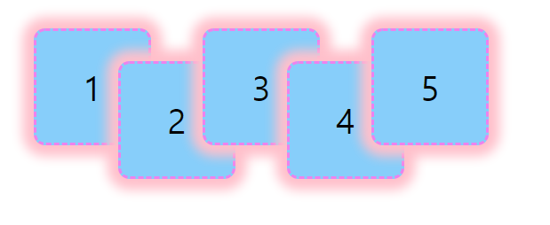
Stack order
그렇게 된다면, html 의 특징인 from top to bottom에 의해서 가장 늦게 작성된 요소5가 가장 가까이, 가장 위에 보이게 된다
이번에는 요소4에 position:relative를 지정해주면 어떨까?
<!DOCTYPE html>
<html lang="ko">
<head>
    <meta charset="UTF-8">
    <meta http-equiv="X-UA-Compatible" content="IE=edge">
    <meta name="viewport" content="width=device-width, initial-scale=1.0">
    <title>Document</title>
    <style>
        *{
            padding:0;
            margin:0;
        }
        .box-group{
            display:flex;
            margin-left:30px;
            margin-top:30px;
        }
        .box-group .box{
            width: 100px;
            height: 100px;
            background-color: lightskyblue;
            border:3px dashed violet;
            border-radius: 10px;
            font-size:30px;
            display:flex;
            justify-content: center;
            align-items: center;
              /*요소 겹침을 확인해보기 위해서 일부러 margin-right을
            음수값으로 설정하기*/
            margin-right:-30px;
            /*
            css box-shadow
            */
            box-shadow:0 0 10px 10px pink;
        }
        /*짝수번째 요소에 대해서 따로 정의하여 요소쌓임순서를 비교할 것*/
        .box-group .box:nth-child(2n){
            margin-top:30px;

        }
        .box1{

        }
        .box2{

        }
        .box3{

        }
        .box4{
            position:relative;
        }
        .box5{

        }
    </style>
</head>
<body>
    <div class="box-group">
        <div class="box box1">1</div>
        <div class="box box2">2</div>
        <div class="box box3">3</div>
        <div class="box box4">4</div>
        <div class="box box5">5</div>
    </div>
</body>
</html>
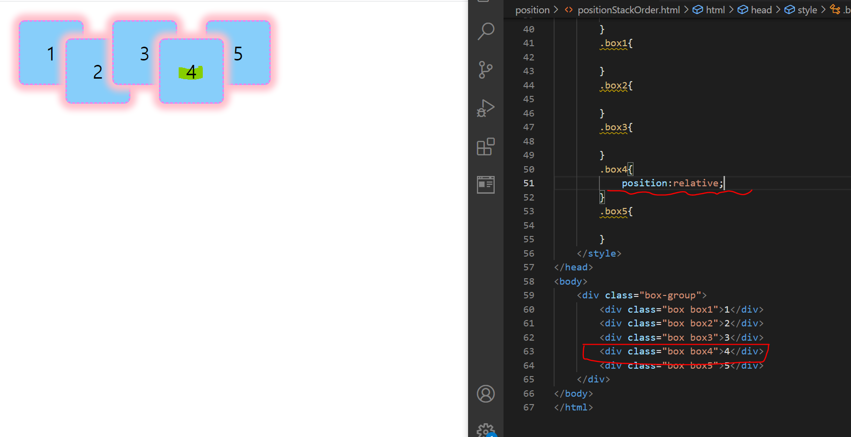
요소쌓임순서-position 조정
요소 4에 position:relative를 지정해주게 된다면, 요소4가 요소5보다 전에 작성되었지만, 쌓임순서가 더 크게 되어 더 가까이 보이게 된다
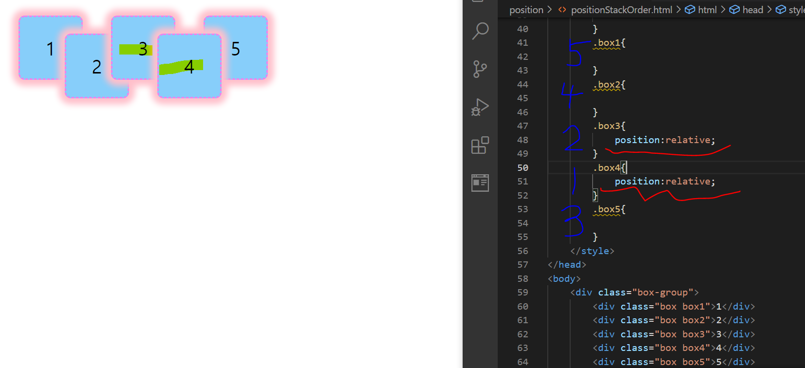
그런데 만약, 요소3에 position:relative를 지정하게 되어서, 요소3과 요소4 모두 position값을 갖는 경우라면 어떨까?
이런 경우, html 작성 순서에 따라(z-index를 따로 작성하지 않았기 때문) 요소4가 제일 위, 그 다음은 3, 그다음이 5가 된다. 그 이후에는 2,1 이 작성순서에 따라 보여지게 된다
<!DOCTYPE html>
<html lang="ko">
<head>
    <meta charset="UTF-8">
    <meta http-equiv="X-UA-Compatible" content="IE=edge">
    <meta name="viewport" content="width=device-width, initial-scale=1.0">
    <title>Document</title>
    <style>
        *{
            padding:0;
            margin:0;
        }
        .box-group{
            display:flex;
            margin-left:30px;
            margin-top:30px;
        }
        .box-group .box{
            width: 100px;
            height: 100px;
            background-color: lightskyblue;
            border:3px dashed violet;
            border-radius: 10px;
            font-size:30px;
            display:flex;
            justify-content: center;
            align-items: center;
              /*요소 겹침을 확인해보기 위해서 일부러 margin-right을
            음수값으로 설정하기*/
            margin-right:-30px;
            /*
            css box-shadow
            */
            box-shadow:0 0 10px 10px pink;
        }
        /*짝수번째 요소에 대해서 따로 정의하여 요소쌓임순서를 비교할 것*/
        .box-group .box:nth-child(2n){
            margin-top:30px;

        }
        .box1{

        }
        .box2{

        }
        .box3{
            position:relative;
        }
        .box4{
            position:relative;
        }
        .box5{

        }
    </style>
</head>
<body>
    <div class="box-group">
        <div class="box box1">1</div>
        <div class="box box2">2</div>
        <div class="box box3">3</div>
        <div class="box box4">4</div>
        <div class="box box5">5</div>
    </div>
</body>
</html>
요소쌓임순서-position이 모두 존재하는 경우
💐 ++참고로, z-index는 기본값으로 0이 들어가 있다!
<!DOCTYPE html>
<html lang="ko">
<head>
    <meta charset="UTF-8">
    <meta http-equiv="X-UA-Compatible" content="IE=edge">
    <meta name="viewport" content="width=device-width, initial-scale=1.0">
    <title>Document</title>
    <style>
        *{
            padding:0;
            margin:0;
        }
        .box-group{
            display:flex;
            margin-left:30px;
            margin-top:30px;
        }
        .box-group .box{
            width: 100px;
            height: 100px;
            background-color: lightskyblue;
            border:3px dashed violet;
            border-radius: 10px;
            font-size:30px;
            display:flex;
            justify-content: center;
            align-items: center;
              /*요소 겹침을 확인해보기 위해서 일부러 margin-right을
            음수값으로 설정하기*/
            margin-right:-30px;
            /*
            css box-shadow
            */
            box-shadow:0 0 10px 10px pink;
        }
        /*짝수번째 요소에 대해서 따로 정의하여 요소쌓임순서를 비교할 것*/
        .box-group .box:nth-child(2n){
            margin-top:30px;

        }
        .box1{
            position:relative;
        }
        .box2{
            position:relative;
        }
        .box3{
            position:relative;
            z-index: 5;
        }
        .box4{
            position:relative;
        }
        .box5{
            position:relative;
            z-index:-1;
        }
    </style>
</head>
<body>
    <div class="box-group">
        <div class="box box1">1</div>
        <div class="box box2">2</div>
        <div class="box box3">3</div>
        <div class="box box4">4</div>
        <div class="box box5">5</div>
    </div>
</body>
</html>
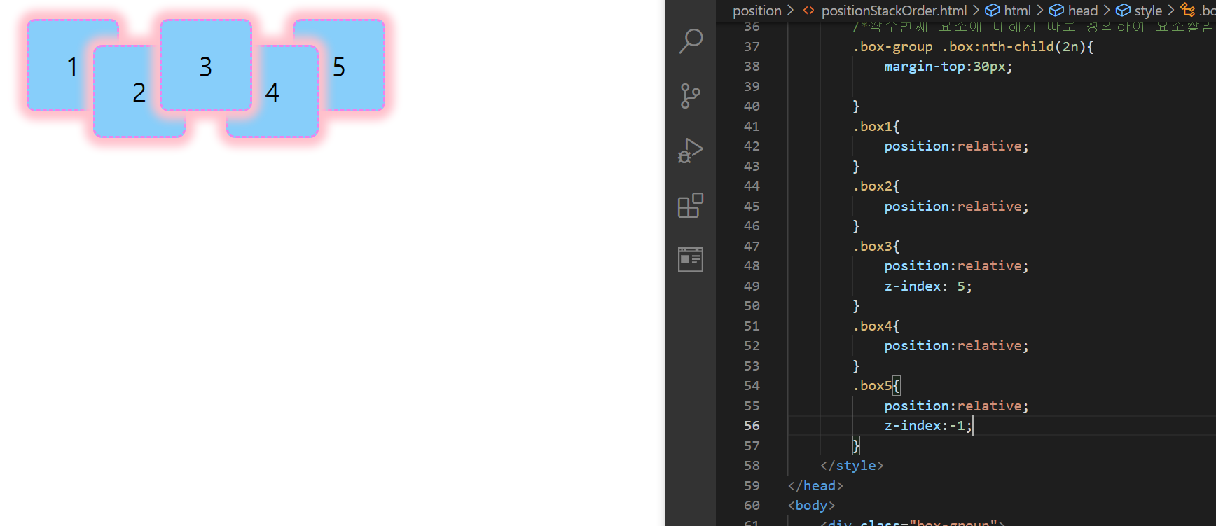
요소쌓임순서-z-index
만약 위와 같이 모든 요소에 position이 존재하고, 요소3에 z-index:5를, 요소5에 z-index:-1을 부여하면 어떻게 될까??
z-index값이 가장 큰 요소3이 가장 위에 보이게 되고, z-index가 가장 작은 5는 사실상 다른 어떤 요소들보다도 맨 뒤에 위치하지만, 화면상으로는 요소1과 비슷하게 보인다
여기서 참고할 만한 사항은 z-index는 음수값도 지원가능하다는 점이다
🌟 z-index는 반드시 position 기준이 존재해야만 사용가능하다!!
마지막으로 한 가지 케이스만 더 확인해보자
요소 3과 요소 4 모두 position 기준이 있고, z-index값이 5로 같다면 어떻게 될까?
<!DOCTYPE html>
<html lang="ko">
<head>
    <meta charset="UTF-8">
    <meta http-equiv="X-UA-Compatible" content="IE=edge">
    <meta name="viewport" content="width=device-width, initial-scale=1.0">
    <title>Document</title>
    <style>
        *{
            padding:0;
            margin:0;
        }
        .box-group{
            display:flex;
            margin-left:30px;
            margin-top:30px;
        }
        .box-group .box{
            width: 100px;
            height: 100px;
            background-color: lightskyblue;
            border:3px dashed violet;
            border-radius: 10px;
            font-size:30px;
            display:flex;
            justify-content: center;
            align-items: center;
              /*요소 겹침을 확인해보기 위해서 일부러 margin-right을
            음수값으로 설정하기*/
            margin-right:-30px;
            /*
            css box-shadow
            */
            box-shadow:0 0 10px 10px pink;
        }
        /*짝수번째 요소에 대해서 따로 정의하여 요소쌓임순서를 비교할 것*/
        .box-group .box:nth-child(2n){
            margin-top:30px;

        }
        .box1{
            position:relative;
        }
        .box2{
            position:relative;
        }
        .box3{
            position:relative;
            z-index: 5;
        }
        .box4{
            position:relative;
            z-index: 5;
        }
        .box5{
            position:relative;
            z-index:-1;
        }
    </style>
</head>
<body>
    <div class="box-group">
        <div class="box box1">1</div>
        <div class="box box2">2</div>
        <div class="box box3">3</div>
        <div class="box box4">4</div>
        <div class="box box5">5</div>
    </div>
</body>
</html>

요소쌓임순서-position 기준이 존재하고, z-index가 같은 경우
해당되는 경우에서는, 위에서 설명된 것처럼, html 작성순서 상 둘 중 가장 마지막에 기록된 요소4가 위에 오고, 그 다음에 요소3이 위치하게 된다
🌺 position 속성의 특징 🌺
- position 속성의 값으로 absolute, fixed 이 지정된 경우에는 display 속성이 대부분 block 으로 바뀜(float에서는 flex, inline-flex 디스플레이를 갖는 요소를 제외하고 대부분 block display로 바뀜)
- position도 display:flex 혹은 display:inline-flex인 경우를 제외하면 대부분의 display가 block으로 변경된다!(예:inline, inline-block 등 ➡️ block)
<!DOCTYPE html>
<html lang="ko">
<head>
    <meta charset="UTF-8">
    <meta http-equiv="X-UA-Compatible" content="IE=edge">
    <meta name="viewport" content="width=device-width, initial-scale=1.0">
    <title>Document</title>
    <style>
        body{
            position:relative;
        }
        .span1{
            width: 100px;
            height: 100px;
            background-color: tomato;
            margin:30px 0;
            position:absolute;
        }
        .span2{
            width: 100px;
            height: 100px;
            background-color: tomato;
            margin:30px 0;
            position:fixed;
            top:120px;;
        }
    </style>
</head>
<body>
    <span class="span1">inline1-absolute</span>
    <span class="span2">inline2-fixed</span>
</body>
</html>
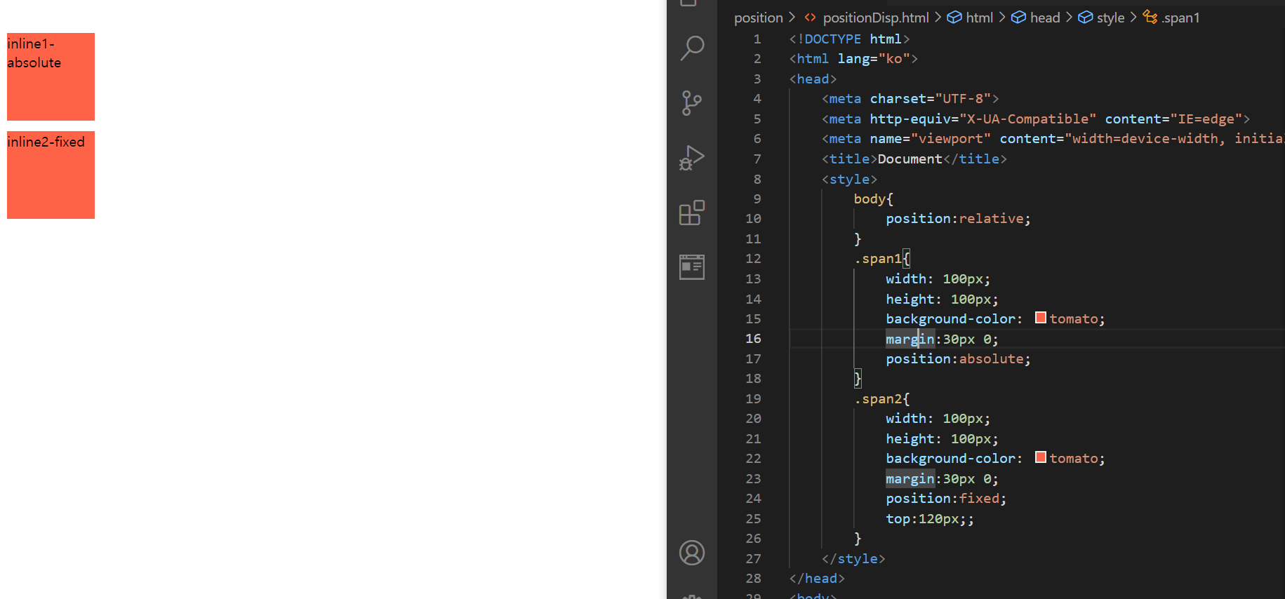
position:absolute, fixed의 display 수정
전에 학습했던 것처럼, span 요소는 분명이 display:inline 인 요소인데, position:absolute 혹은 position:fixed를 부여하였더니, 블록요소처럼 크기도 갖고 위아래 margin도 갖게됨을 확인해볼 수 있다